Addons for Elementor Documentation
Search for answers or browse our knowledge base.
Modal Popup
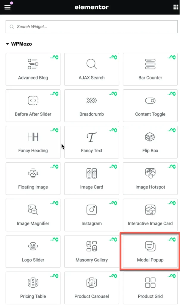
Once WPMozo Addons is activated it adds a number of widgets to the Elementor builder. To insert the widget, use the following steps.
- Create/edit a page/post that uses Elementor builder.
- Create/edit container.
- Search widget Modal Popup under WPMozo.
Content
Configuration setting
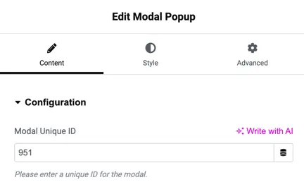
Unique Modal ID
To make the modal work properly, you need to give it a unique ID.
This unique ID helps the plugin tell each popup apart in the backend. If you don’t add one, the plugin will create it for you.
If you want to pick your own ID, you can use something simple like “modal-1” or “modal-2.” Just don’t use spaces in the name to avoid any issues.
Trigger type
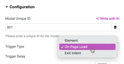
Here you get the option to select modal trigger type. Select any from available options:
- On-Page Load
- Element
On-Page load
When the page loads, the modal popup shows up right away to grab the visitor’s attention.
Trigger delay: This option lets you set a specific wait time (in microseconds) before the modal popup appears after the page has loaded.
Once the delay is over, the modal popup will appear with smooth animations.
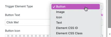
Element
In this section, you can choose the type of element you want. The available options include Button, Image, Icon, Text, Element CSS ID, and Element CSS Class. Simply select the option that best suits your needs.
Modal header
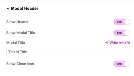
Show Header
Turn this option on to display the header section in your modal popup.
Show Modal Title
Enable this to show the title text in the modal header.
Modal Title
Use this field to add the text you want as the title of the modal.
Show Close Icon
Switch this option on to display a close icon in the modal, allowing users to close it easily.
Modal body setting
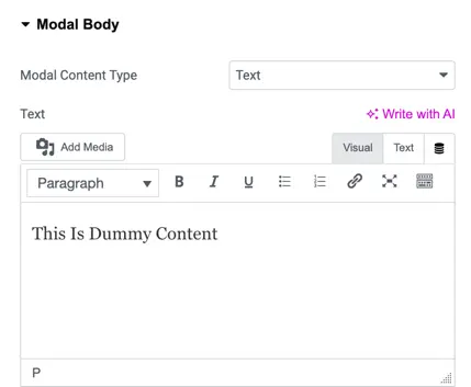
Modal Content Type
Select the type of content you want to display in the modal. Options include text, image, video, and elementor library layout.
Text
Use this field to add the content for your modal. You can enter plain text, format it with headings or paragraphs, or even add media like images or videos.
Modal footer setting
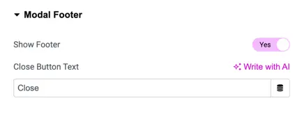
Show Footer
- This setting lets you choose whether to display a footer in the modal (popup window).
- Options:
- Yes: The footer will appear in the modal.
- No: The footer will be hidden.
Close Button Text
- This allows you to customize the text that appears on the button used to close the modal.
- Default: The button text is set to “Close” by default.
- Custom Text: You can change this to any other text of your choice.
Scroll settings
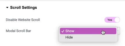
Disable Website Scroll
- This setting allows you to stop the webpage from scrolling when the modal (popup window) is open.
- Options:
- Yes: Website scrolling will be disabled while the modal is open.
- No: Website scrolling will continue as usual even when the modal is open.
Modal Scroll Bar
- This lets you control whether the scroll bar inside the modal is shown or hidden.
- Options:
- Show: The scroll bar inside the modal will be visible, allowing users to scroll if the content is long.
- Hide: The scroll bar will be hidden, preventing users from scrolling inside the modal.
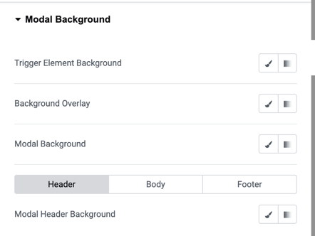
Modal background
- Trigger Element Background
- This setting allows you to change the background color of the element that triggers the modal (for example, a button).
- How to use: Click the color picker icon to choose a color for the background.
- Background Overlay
- This controls the background overlay color that appears behind the modal when it’s open, helping to focus attention on the modal.
- Use the color picker to adjust the overlay background color.
- Modal Background
- This option allows you to set the background color for the entire modal.
- Select a color using the color picker for the modal’s background.
- Modal Header Background
- This setting lets you customize the background color of the modal’s header section. Choose a color for the modal header background using the color picker.
Style
Trigger element alignment
- Options: Left, Center, Right
- Use this setting to align the trigger element (the button or link that activates the modal) in your desired position.
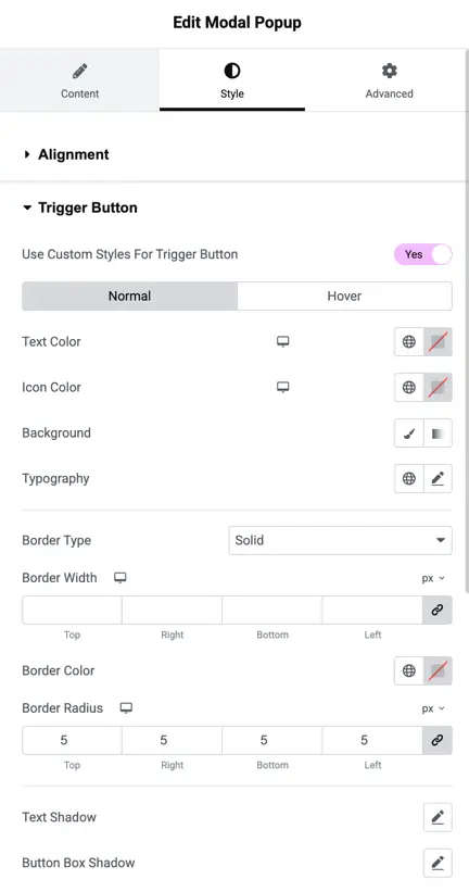
Trigger button settings
- Use Custom Styles for Trigger Button
- This option enables custom styling for the trigger button, including hover and normal states.
- Text Color
- Set the color of the text inside the trigger button.
- Icon Color
- Set the color of the icon (if any) inside the trigger button.
- Background
- Choose the background color of the trigger button.
- Typography
- Set custom typography for the trigger button text (font size, family, weight, etc.).
- Border Type
- Customize the border type of the trigger button.
- Border Width
- Define the width of the button’s border. Specify values for each side (Right, Bottom, Top, Left).
- Border Color
- Set the color of the button’s border.
- Border Radius
- Define rounded corners for the button by specifying radius values for each corner (Right, Top, Bottom, Left).
- Text Shadow
- Apply a text shadow to the button’s text.
- Button Box Shadow
- Apply a box shadow around the button to create depth.
Modal title text settings
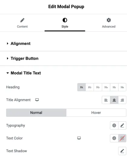
- Heading
- Select the heading tag to use for the modal title.
- Title Alignment
- Align the title inside the modal.
- Typography
- Customize the typography (font, size, etc.) of the modal title.
- Text Color
- Set the text color for the modal title.
- Text Shadow
- Apply a text shadow effect to the modal title.
Modal body text settings
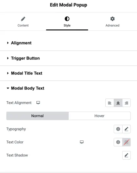
- Text Alignment
- Align the text in the modal body.
- Typography
- Set custom typography for the body text inside the modal.
- Text Color
- Customize the color of the modal body text.
- Text Shadow
- Add a text shadow to the modal body text.
Modal close icon settings
- Close Icon Font Size
- Set the size for the modal close icon.
- Close Icon Color
- Choose the color for the close icon.
Modal close button settings
- Use Custom Style for Close Button
- Enable custom styling for the close button in the modal.
- Show Close Button Icon
- Display an icon for the close button.
- Close Button Icon Position
- Choose the position of the close button icon.
- Show Icon on Hover
- Control whether the icon shows on hover.
- Button Alignment
- Adjust the alignment of the close button within the modal.
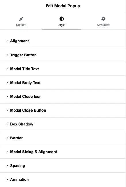
Modal box shadow settings
- Normal & Hover Box Shadow
- Apply box shadows for both normal and hover states for various modal components (Trigger Element, Modal Box, Modal Header, Modal Footer).
Modal border settings
- Normal & Hover Border
- Customize the border for the modal, both in normal and hover states.
- Modal Border Radius
- Set the border radius for the modal box, defining rounded corners.
Modal sizing and alignment
- Modal Position
- Choose the modal’s position on the screen.
- Modal Width
- Set the width of the modal.
- Modal Height
- Set the height of the modal.
Modal spacing settings
- Padding & Margin
- Define padding and margin for the modal, modal header, body, and footer.
- Modal Header Padding
- Set padding for the modal header.
- Modal Body Padding
- Adjust padding for the body of the modal.
- Modal Footer Padding
- Set padding for the modal footer.
Animation settings
- Modal Entrance Animation
- Choose the animation effect for the modal when it enters the screen.
- Trigger Entrance Animation
- Select the animation effect for the trigger element when it is clicked.