Addons for Elementor Documentation
Search for answers or browse our knowledge base.
Logo Slider
This widget comes free with WPMozo Addons Lite. To use it, simply install and activate the free version of plugin.
https://wordpress.org/plugins/wpmozo-addons-lite-for-elementor
How to add widget on page
Once WPMozo Addons is activated it adds a number of widgets to the Elementor builder. To insert the widget, use the following steps.
- Create/edit a page/post that uses Elementor builder.
- Create/edit container.
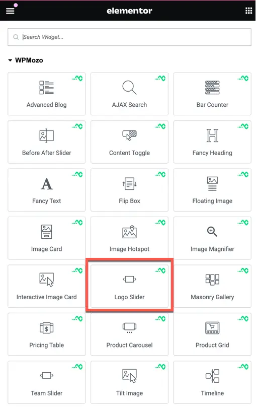
- Search widget Logo Slider under WPMozo.
Content tab
Logo list
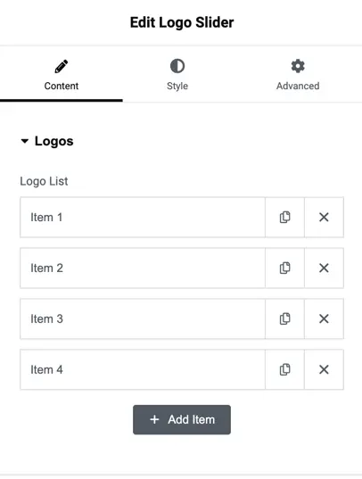
This section allows you to manage the logos that will appear in the slider. Each item represents a logo.
- Add Item: Click this button to add a new logo to the list.
- Item 1, Item 2, Item 3, Item 4: These are placeholders for the logos you will upload. You can edit or delete them using the available options.
Logo item settings
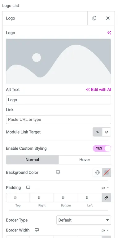
When you click on an individual logo item in the Logo List, you will see several customization options:
1. Logo
- This is the section where you can upload the logo image that will appear in the slider. Click on the image area to upload or select a logo from your media library.
2. Alt Text
- Alt text provides alternative information for the image if it cannot be displayed.
3. Link
- Use this field to link the logo to a URL. If you want users to be directed to a specific webpage when they click on the logo, paste the URL here.
4. Module Link Target
- This setting allows you to choose whether the link opens in the same tab or a new tab.
- Same tab: The link will open in the current browser tab.
- New tab: The link will open in a new browser tab, ensuring the user stays on the original page.
5. Enable Custom Styling
- Toggle this setting to “Yes” to customize the appearance of the logo further. When enabled, additional styling options become available for normal and hover states.
- Normal: This section lets you customize the default appearance of the logo.
- Hover: These settings allow you to define how the logo will look when a user hovers their mouse over it.
6. Background Color
- Use this option to set a background color for the logo area. You can select a color from the color picker or use a hex code.
7. Padding
- Adjust the space inside the logo area using the padding settings. You can customize the padding for each side (Top, Right, Bottom, Left) individually, or apply the same value to all sides.
8. Border Type
- Choose a border style (e.g., solid, dashed, or none) around the logo. This gives you control over how the logo is framed on the page.
9. Border Width
- Define the thickness of the border around the logo. You can adjust this in pixels to fit your design.
Slider settings
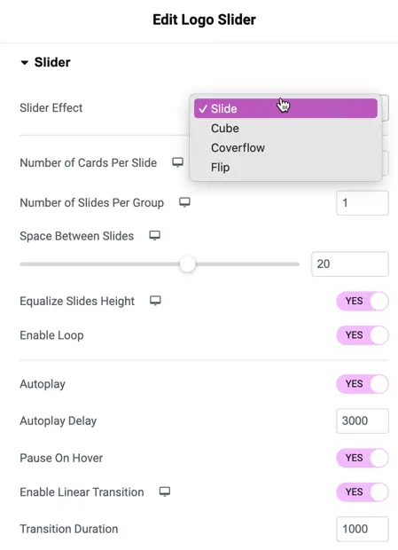
1. Slider Effect
- Use: Choose the type of animation between slides. Options are:
- Slide: Basic sliding animation.
- Cube: Cube-style transition.
- Coverflow: 3D coverflow effect.
- Flip: Slides flip like a card.
2. Number of Cards Per Slide
- Use: Set how many logo cards to display at a time in each slide.
3. Number of Slides Per Group
- Use: Select how many slides to show together as one group.
4. Space Between Slides
- Use: Adjust the gap or space between each slide in the slider.
5. Equalize Slides Height
- Use: If set to “Yes,” this option ensures all slides have the same height.
6. Enable Loop
- Use: When set to “Yes,” the slider will loop continuously without stopping.
7. Autoplay
- Use: Enable this setting to make the slides move automatically without any user interaction.
8. Autoplay Delay
- Use: Set the amount of time (in milliseconds) the slider waits before moving to the next slide. Example: 3000ms = 3 seconds.
9. Pause On Hover
- Use: When “Yes,” the autoplay will pause when users hover over the slider.
10. Enable Linear Transition
- Use: This makes the transition between slides smooth and linear.
11. Transition Duration
- Use: Set the time (in milliseconds) the transition between slides will take. Example: 1000ms = 1 second.
Arrows settings
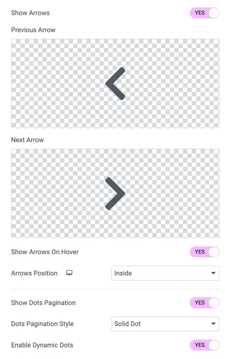
1. Show Arrows
- Use: Choose whether to display navigation arrows on the slider.
2. Previous Arrow/Next Arrow
- Use: Customize the appearance of the previous and next navigation arrows.
3. Show Arrows On Hover
- Use: If set to “Yes,” the arrows will only show when the user hovers over the slider.
4. Arrows Position
- Use: Set where the navigation arrows will be located. Example: Inside or Outside the slider.
Dots pagination settings
1. Show Dots Pagination
- Use: Enable this to show pagination dots at the bottom of the slider, allowing users to navigate between slides.
2. Dots Pagination Style
- Use: Choose the style of pagination dots. Example: Solid Dot.
3. Enable Dynamic Dots
- Use: When enabled, the pagination dots will adjust dynamically based on the content.
Style tab
Slider customization
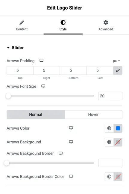
- Arrows Padding
This setting controls the space (in pixels) around the arrows on the slider. You can adjust the padding for the top, right, bottom, and left sides of the arrows individually. - Arrows Font Size
This controls the size of the arrows. You can increase or decrease the arrow size by adjusting this setting. - Arrows Color
Use this option to change the color of the arrows on the slider. You can select a custom color based on your design. - Arrows Background
This setting allows you to set a background color for the arrows. If you want the arrows to stand out with a different background color, use this option. - Arrows Background Border
You can add a border to the arrow background using this setting. This is helpful if you want a border around the arrow background for better visibility. - Arrows Background Border Color
Choose the color of the border around the arrow background. This is used if a border is applied in the previous setting.
logo styling
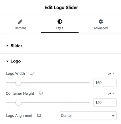
Logo Width
Adjust the width of the logos in the slider. You can set the desired width (in pixels) using the slider or input a specific value.
Container Height
This setting controls the height of the container that holds the logos. Adjust the height (in pixels) based on the size you need.
Logo Alignment
Choose how the logos should be aligned within the slider. Options include:
- Top: Aligns the logos to the top.
- Center: Aligns the logos in the center (default).
- Bottom: Aligns the logos to the bottom.