Addons for Elementor Documentation
Search for answers or browse our knowledge base.
Blog Timeline
This widget comes free with WPMozo Addons Lite. To use it, simply install and activate the free version of plugin.
https://wordpress.org/plugins/wpmozo-addons-lite-for-elementor
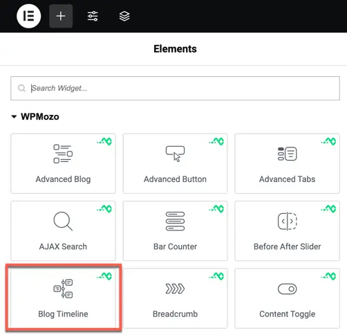
How to add widget on page
Once the WPMozo Addons plugin is activated, it introduces several widgets to the Elementor builder. To add the Blog Timeline widget, follow these steps:
- Open or edit a page or post that uses the Elementor builder.
- Create or edit a container.
- In the widget search bar, type “Blog Timeline” under WPMozo.
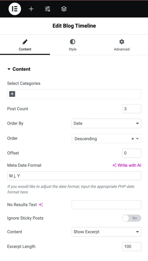
Content configuration
The Content Configuration section lets you control which blog posts appear in the timeline and how they are displayed. Below are the available options:
Content option
Select categories
Use this setting to filter posts by category.
- You can select one or multiple categories.
- Only posts from the selected categories will be displayed.
- If nothing is selected, posts from all categories will be shown.
Post count
Set how many blog posts you want to show in the timeline.
- Example:
5will display the latest 5 posts.
Order By
Choose how the posts should be sorted.
Options includes:
- Post ID
- Post Author
- Title
- Date
- Last Modified Date
- Parent Id
- Random
- Comment Count
- Menu Order
Order
Set the sorting direction for the posts.
Options:
- Descending (DESC) – Newest posts first
- Ascending (ASC) – Oldest posts first
Offset
Use this to skip a certain number of posts from the beginning.
- Example: If
Offset = 2, the first 2 posts will be skipped, and display starts from the 3rd post.
No results text
Enter a custom message that will be shown when no posts are found based on the selected settings.
Ignore sticky posts
Enable this option if you want to exclude sticky posts from the timeline view. Sticky posts are usually highlighted or pinned in WordPress.
Content: Excerpt or Full content
Choose whether to display the post excerpt or the full content.
Options:
- Excerpt
- Full Content
Excerpt length (Visible only if “Excerpt” is selected)
Set how many words to show in the excerpt.
- Example:
20will show the first 20 words of the post.
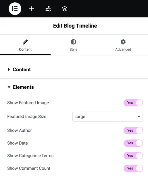
Elements
The Elements settings let you control which parts of each blog post are shown in the timeline, such as the featured image, author name, date, and more.
Style options
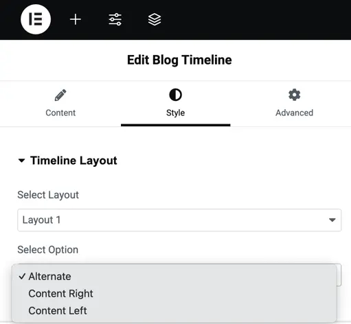
Timeline layout
The Timeline Layout section provides two layout types to choose from, and within each layout, you can select how the content is positioned. Under “Select Layout”, you can choose between Layout 1 and Layout 2, each offering a different visual structure for the timeline.
After selecting a layout, you can use the “Select Option” setting to define how the post content should appear along the timeline:
Content Right – All post content is aligned on the right side of the timeline.
Alternate – Post content appears in a zig-zag format, alternating between the left and right sides of the timeline.
Content Left – All post content is aligned on the left side of the timeline.
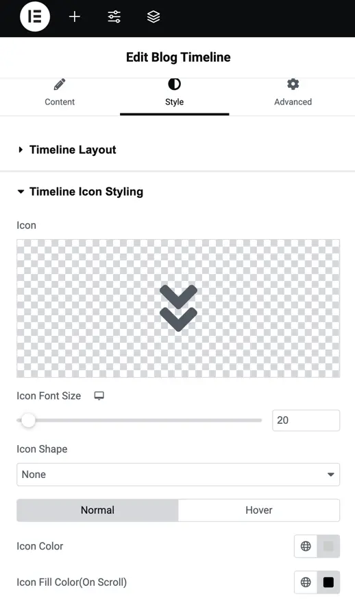
Timeline icon styling
This section lets you customize the timeline icons that appear next to each post on the timeline, helping to visually connect each post entry with the timeline flow.
Icon
Use this option to choose the icon that will appear for each post in the timeline.
- You can select any icon from the available icon library.
- This icon will be displayed at the intersection of the timeline line and each post block.
Icon font size
Set the size of the icon using any CSS-supported unit like px, em, or %.
- Example:
24pxfor a medium-sized icon.
This controls how big or small the icon appears in the timeline.
Icon color
Set the color of the icon itself (the actual symbol).
- Example: You can make the icon black, white, or brand-colored to suit your design.
Icon fill color (on scroll)
Choose the background fill color of the icon when the timeline is scrolled and the icon becomes active or visible in the viewport.
This effect helps highlight the current step or post as the user scrolls through the timeline.
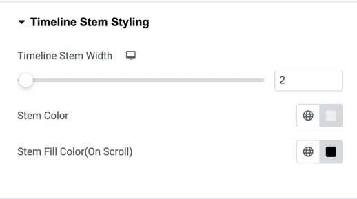
Timeline stem styling
This section allows you to control the appearance of the stem (vertical line) of the timeline. You can set the Timeline Stem Width using a slider or manually enter a number. The Stem Color option lets you pick a color for the stem line, and the Stem Fill Color (On Scroll) option lets you choose a different color that appears when the timeline is scrolled.
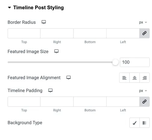
Timeline post styling
In this section, you can style the individual post containers. Border Radius lets you set the roundness of the post box edges. Featured Image Size controls how large the featured image will appear, and you can choose the Featured Image Alignment (left, center, or right). Timeline Padding allows you to add spacing inside the post box. You can also select a Background Type to apply a background color or image to the post.
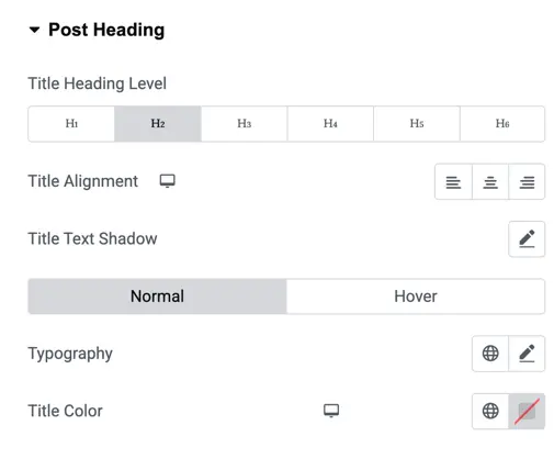
Post heading
This area lets you customize the look of post titles. You can choose the Title Heading Level from H1 to H6 depending on your design preference. Title Alignment lets you align the text left, center, or right. You can also apply a Title Text Shadow and set its styling for both Normal and Hover states. Additionally, there are options for Typography (font style, size, weight) and Title Color.
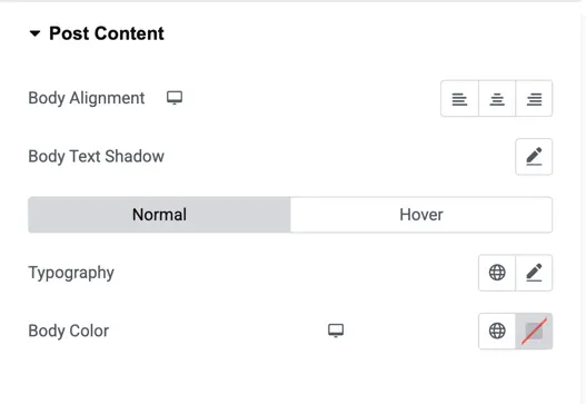
Post content
This section handles the styling of the post’s main content. Body Alignment allows you to position the text left, center, or right. Body Text Shadow can be added for both normal and hover states. You can also control the Typography of the body text and change the Body Color to suit your design.
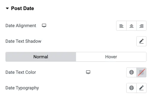
Post date
The date styling section provides options to align the date using Date Alignment, and add a Date Text Shadow for both normal and hover states. You can choose a Date Text Color and set custom Date Typography to match your overall style.
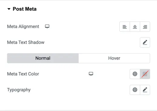
Post meta
This section allows you to style post metadata such as author or comment count. Meta Alignment lets you align the text left, center, or right. You can also add a Meta Text Shadow and define it for both normal and hover states. Additionally, you can customize the Meta Text Color and choose Typography settings to style the meta text.