Addons for Elementor Documentation
Search for answers or browse our knowledge base.
Background Switcher
The Background Switcher Widget for Elementor lets you create stunning layouts where background images change smoothly as users hover over content blocks, all without writing any code. You can design horizontal or vertical styles with seamless transitions and interactive hover effects, making it perfect for travel showcases, product highlights, or service comparisons.
This widget comes free with WPMozo Addons Lite. To use it, simply install and activate the free version of plugin.
https://wordpress.org/plugins/wpmozo-addons-lite-for-elementor
How to add widget on page
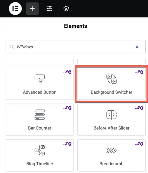
To add the Background Switcher widget, follow these steps.
- Create/edit a page/post that uses Elementor builder.
- Create/edit container.
- Search widget WPMozo Background Switcher under WPMozo.
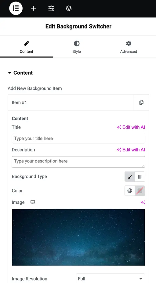
Content
Content settings
Add New Background Item: Click to add a new item.
Content: Add a title and description for the item.
Background Type: Choose between “Color” or “Image” for the background.
Image Resolution: Set the image quality.
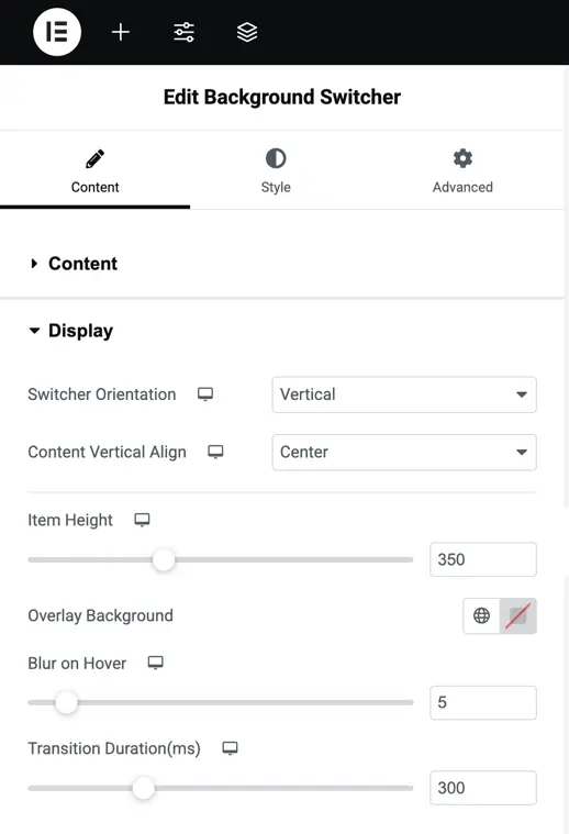
Display settings
- Switcher Orientation: Choose if the layout is horizontal or vertical to match your design.
- Content Vertical Align: Set where the content sits vertically—top, center, or bottom.
- Item Height: Adjust the height of each item using a slider to fit your layout.
- Overlay Background: Pick a color for the overlay that appears over the background.
- Blur on Hover: Set how much blur effect happens when users hover, using a slider.
- Transition Duration (ms): Change how fast the background switch happens, using a slider.
Customization option
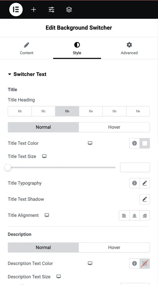
Style switcher text
Title
- Title Heading: Choose the heading size for your title, from H1 to H6.
- Normal and Hover Tabs: Set styles for normal and hover states.
- Title Text Color: Pick a color for the title text.
- Title Text Size: Adjust the size of the title text with a slider.
- Title Typography: Change the font style of the title, like bold or italic.
- Title Text Shadow: Add a shadow behind the title text to make it stand out.
- Title Alignment: Set the title position to left, center, or right.
Description
- Normal and Hover Tabs: Set styles for normal and hover states.
- Description Text Color: Choose a color for the description text.
- Description Text Size: Adjust the size of the description text with a slider.
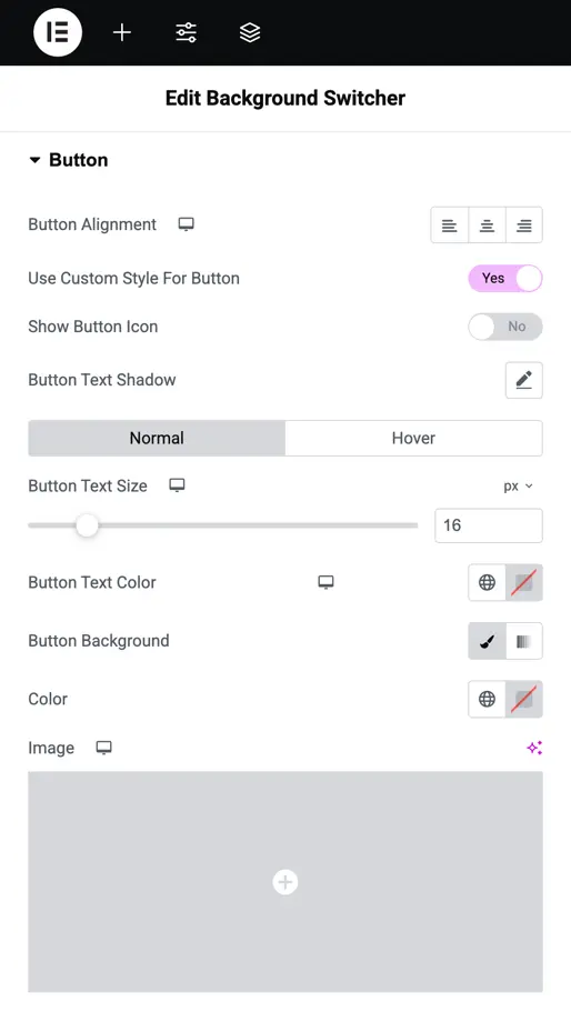
Style button
- Button Alignment: Set the button position to left, center, or right.
- Use Custom Style For Button: Choose “YES” to customize the button’s look.
- Show Button Icon: Select “YES” to add an icon to the button.
- Button Text Shadow: Add a shadow behind the button text to make it stand out.
- Normal and Hover Tabs: Set styles for normal and hover states.
- Button Text Size: Adjust the size of the button text with a slider.
- Button Text Color: Pick a color for the button text.
- Button Background: Choose between “Color” or “Image” for the button background and set your preference.