Addons for Elementor Documentation
Search for answers or browse our knowledge base.
Advanced Tabs
Once the WPMozo Addons plugin is activated, it adds several widgets to the Elementor builder. To insert the Advanced Tabs widget, follow these steps.
- Create/edit a page/post that uses Elementor builder.
- Create/edit container.
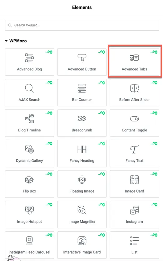
- Search widget Advanced Tabs under WPMozo.
Content
Content configuration
Tab Trigger
Choose how the tab switches either when the user clicks or hovers over the tab.
Tab Orientation
Set the layout direction of the tabs: Horizontal or Vertical.
Horizontal Tab Alignment
When using Horizontal orientation, select the position of the tabs: Top or Bottom.
Fullwidth Tab
Enable this option to make the tabs stretch across the full width of their container.
Tabs Background
Customize the background color, gradient, or image for the tab labels.
Content Background
Set a custom background for the content area displayed when a tab is active.
Items (Tab Content)
Add and manage the individual tabs for your Advanced Tabs widget.
- Title: Set the label for each tab.
- Add Item: Click to add a new tab.
Each tab allows you to set its own title and content individually.
Title Type
Select the type of content you want to display as the tab title:
- Text – Show only text.
- Text with Icon – Display text along with an icon.
- Text with Image – Display text along with an image.
- Only Icon – Show only an icon as the tab title.
- Only Image – Show only an image as the tab title.
Title
Enter the title text that will appear on the tab (if using Text, Text with Icon, or Text with Image).
Content Type
Choose the type of content to show when the tab is active:
- Text – Add content directly using the WordPress editor.
- Elementor Library Layout – Select a pre-designed layout from the Elementor Template Library.
Content
If Text is selected, use the WordPress editor to format your content, add media, or write text.
Button settings
Show Button
Toggle to display a button inside the tab content.
Button Text
Enter the text to display on the button.
Button Link URL
Add the URL where the button will link to.
Button Link Target
Choose whether the link should open in the Same Tab or a New Tab.
Use Custom Style for Button
Enable if you want to apply custom button styles (color, typography, etc.) from the Style tab.
Background
Content Background
Set a background color, gradient, or image for the tab content area.
Style tab
These settings allow you to customize how tab titles appear in both their inactive and active states.
Title alignment
Choose the alignment of the tab titles:
- Left
- Center
- Right
Inactive title
These options control the style of tabs that are not currently selected.
- Tab Typography: Set font family, weight, style, and more.
- Tab Text Shadow: Add shadow effects to the tab text.
- Tab Background Color: Pick a background color for inactive tabs.
- Tab Text Color: Set the color of the text for inactive tabs.
- Tab Text Size: Adjust the size of the tab title text.
You can customize these for both Normal and Hover states.
Active title
These options apply to the currently selected (active) tab.
- Active Tab Typography: Customize font properties for the active tab.
- Active Tab Text Shadow: Add shadow styling to the active tab title.
- Active Tab Background Color: Set a background color for the active tab.
- Active Tab Text Color: Choose the text color for the active tab.
- Active Tab Text Size: Adjust the font size of the active tab’s title.
These can also be styled for Normal and Hover states separately.
Alignment
Set the alignment for icons or images inside the tabs.
- Icon/Image Alignment: Options like Left, Center, or Right.
Icon settings
Control the display and style of icons in the tabs.
- Icon Font Size: Adjust the size of the icons.
- Icon Color: Set color for default state.
- Active Icon Color: Choose a color when the tab is active.
Body settings
Customize the content area inside each tab.
- Typography & Font: Set font type and style for the tab content.
- Text Color: Choose color for body content.
- Text Shadow: Add shadow for body content text.
- Body Alignment: Align the tab content text (left, center, right, or justified).
Button settings
If your tab contains a button, you can align it easily.
- Button Alignment: Align buttons left, center, or right.
Sizing
Control dimensions for tabs and images inside tabs.
- Tab Width: Define how wide each tab title should be.
- Image Width: Set size for images/icons within the tabs.