Addons for Elementor Documentation
Search for answers or browse our knowledge base.
Advanced Buttons
This widget comes free with WPMozo Addons Lite. To use it, simply install and activate the free version of plugin. With this free widget, you can create eye-catching buttons in Elementor, customizing the text, icons, and hover effects all without writing any custom CSS.
https://wordpress.org/plugins/wpmozo-addons-lite-for-elementor
How to add widget on page
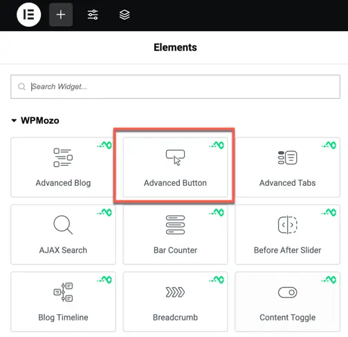
Once the WPMozo Addons plugin is activated, it introduces several widgets to the Elementor builder. Among them, you can use the Advanced Buttons widget by simply dragging and dropping it into your layout. To add the widget, follow these steps:
- Create/edit a page/post that uses Elementor builder.
- Create/edit container.
- Search widget Advanced Buttons under WPMozo.
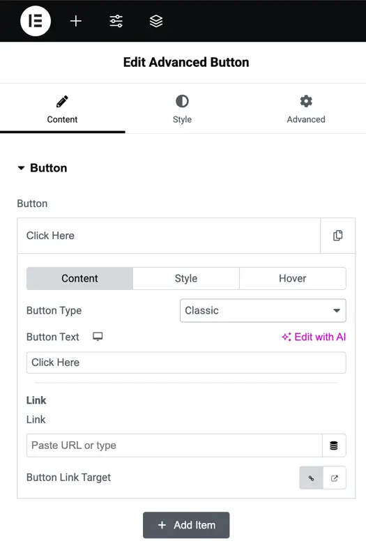
Button content options
- Button Text: Set the button’s label (default: “Click Here”).
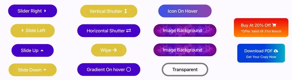
- Button Type: Choose the style Classic (standard) or Conversion (optimized for calls-to-action).
- Link: Add a URL for the button to link.
- Button Link Target: Set link behaviour open in the same tab or a new tab.
- Add Item: Add more buttons to the widget for multiple button setups.
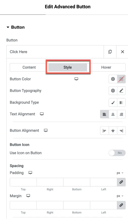
Style settings
Button Color: Set the button’s background and text colors.
Button Typography: Customize the font, size, weight, and style of the button text.
Background Type: Choose the background style (e.g., solid color, gradient).
Text Alignment: Align the button text (left, center, right).
Button Alignment: Align the button itself within its container (left, center, right).
Button Icon: Add an icon to the button (toggle “Use Icon on Button” to Yes/No).
Padding: Adjust the inner spacing of the button (Top, Right, Bottom, Left).
Margin: Adjust the outer spacing around the button (Top, Right, Bottom, Left).
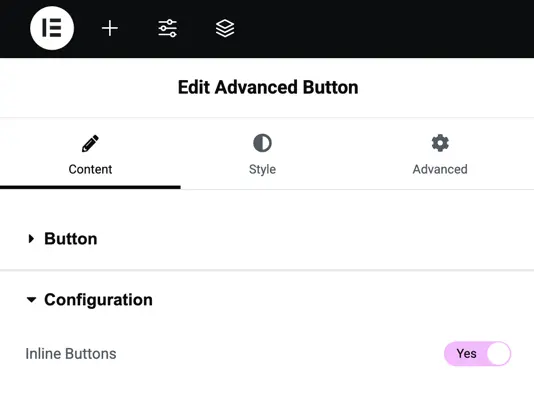
Configuration settings
Inline Button: Toggle to display multiple buttons in a horizontal (inline) layout instead of a vertical stack (Yes/No; default typically No). This setting is useful for creating a row of buttons side by side.