Addons for Elementor Documentation
Search for answers or browse our knowledge base.
Advanced Blog Slider
Once the WPMozo Addons plugin is activated, it introduces several widgets to the Elementor builder. To add the Advanced Blog Slider widget, follow these steps:
- Open or edit a page or post that uses the Elementor builder.
- Create or edit a container.
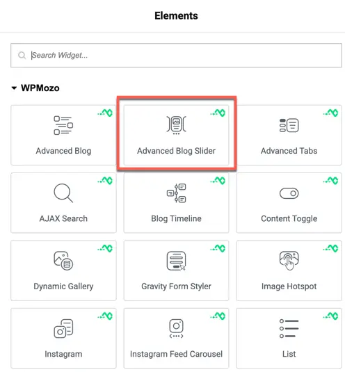
- In the widget search bar, type “Advanced Blog Slider” under WPMozo.
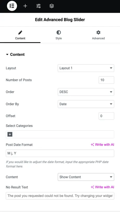
Content
Content settings
- Layout: Choose the visual layout style for the slider.
- Number of Posts: Specify the total number of posts to show in the slider.
- Order: Select the sorting order of posts—ASC (ascending) or DESC (descending).
- Order By: Sort posts based on a specific criterion (e.g., Date, Title).
- Offset: Skip a set number of posts before starting the display.
- Select Category: Filter posts by choosing specific categories.
- Post Date Format: Define the format for displaying post dates (e.g., M j, Y for May 16, 2025).
- Content: Toggle to display post content (e.g., Show Excerpt).
- Excerpt Length: Set the word count for the post excerpt.
- No Result Text: Customize the message shown when no posts are found.
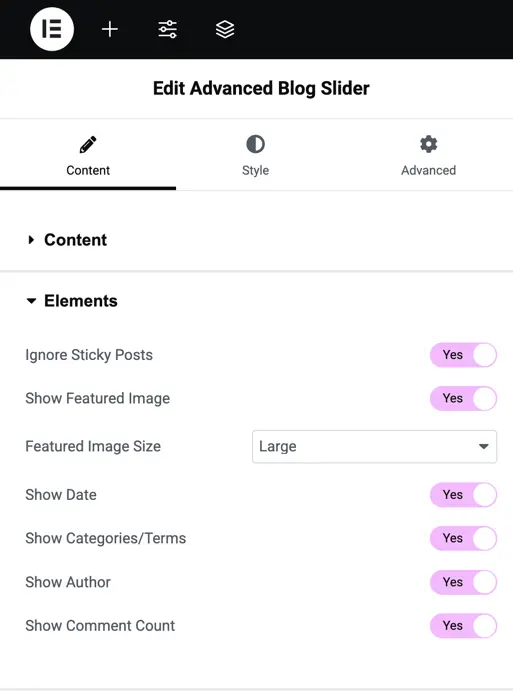
Elements settings
- Ignore Sticky Posts: Exclude sticky posts from being displayed in the slider (Yes/No).
- Show Featured Image: Display the featured image of each post in the slider (Yes/No).
- Featured Image Size: Choose the size of the featured image (e.g., Large, Medium, Thumbnail).
- Show Read More Link: Add a “Read More” link to each post in the slider (Yes/No).
- Read More Text: Customize the text for the “Read More” link.
- Show Date: Display the publication date of each post (Yes/No).
- Show Categories/Terms: Show the categories or taxonomy terms associated with each post (Yes/No).
- Show Author: Display the name of the post’s author (Yes/No).
- Show Comment Count: Show the total number of comments for each post (Yes/No).
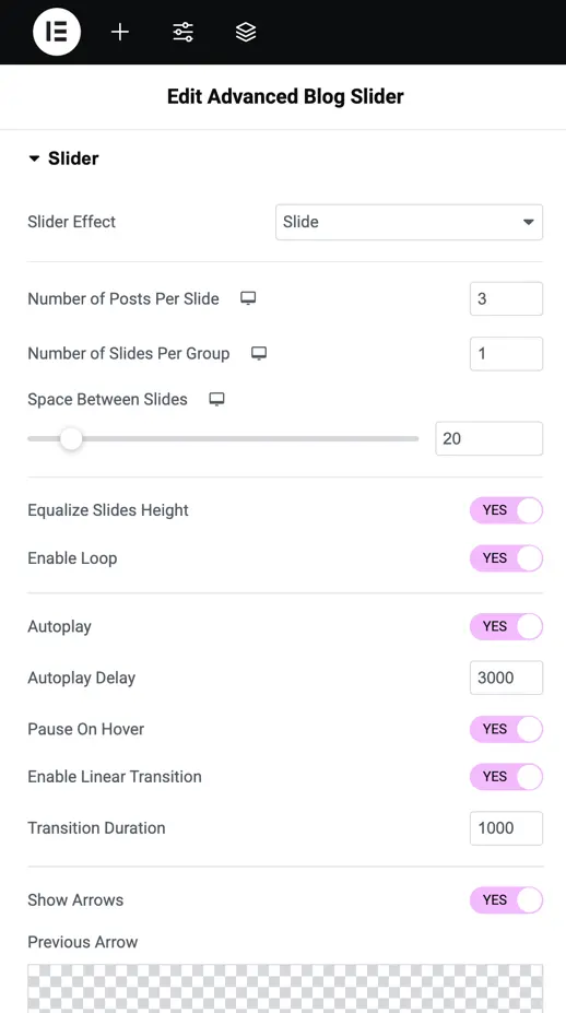
Slider settings
- Slider Effect: Select the animation style for slide transitions (e.g., Slide, Fade).
- Number of Posts Per Slide: Set how many blog posts appear on a single slide.
- Number of Slides Per Group: Group multiple slides to transition together as a set.
- Space Between Slides: Adjust the pixel gap between slides for spacing.
- Equalize Slides Height: Ensure all slides have the same height for uniformity (Yes/No).
- Enable Loop: Allow the slider to loop back to the first slide after the last one (Yes/No).
- Autoplay: Automatically transition between slides without user input (Yes/No).
- Autoplay Delay: Set the time (in milliseconds) between automatic slide transitions.
- Pause On Hover: Pause the autoplay when the user hovers over the slider (Yes/No).
- Enable Linear Transition: Apply smooth, linear transitions between slides (Yes/No).
- Transition Duration: Set the speed of slide transitions in milliseconds.
- Show Arrows: Display navigation arrows for manual slide control (Yes/No).
- Show Arrows On Hover: Show navigation arrows only when the user hovers over the slider (Yes/No).
- Arrows Position: Choose where arrows appear (e.g., Inside, Outside).
- Show Dots Pagination: Display dot navigation to indicate and navigate slides (Yes/No).
- Dots Pagination Style: Select the visual style of the pagination dots (e.g., Solid Dot).
- Enable Dynamic Dots: Adjust the number of dots dynamically based on slide content (Yes/No).
Blog slider style customization
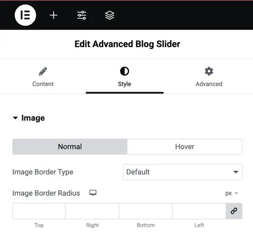
Image border type
- Image Border Type: Choose a border style like solid, dashed, dotted, or none.
- Image Border Radius: Set how rounded the corners should be. You can apply the same value to all corners or adjust each one (top, right, bottom, left) separately. You can also select units like px or %.
Meta Icon
Color: Choose a color for the icons in both Normal and Hover states. You can set different colors for desktop, tablet, and mobile views using the responsive icon.
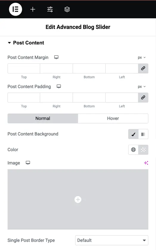
Post content
- Post Content Margin & Padding: Adjust spacing around and inside the post content box individually (Top, Right, Bottom, Left).
- Post Content Background: Set a background color or image for the content area in Normal or Hover states.
- Single Post Border Type: Choose a border style like solid, dashed, or none.
- Single Post Border Radius: Round the corners of the post box by entering a pixel value.
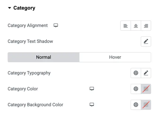
Category
- Category Alignment: Align the category text left, center, or right.
- Category Text Shadow: Add a shadow effect behind the text.
- Normal / Hover: Set separate styles for when the category is idle or hovered.
- Category Typography: Adjust font, size, weight, spacing, etc.
- Category Color: Change the text color.
- Category Background Color: Set a background color behind the category label.
Slider settings panel
- Slider Container Padding: Adjust spacing inside the slider container.
- Arrows Padding: Add space around the slider arrows for better positioning.
- Box Shadow: Apply shadow around the slider box for depth.
- Arrows Font Size: Control the size of the navigation arrows.
- Normal / Hover: Set separate arrow styles for normal and hover states.
- Arrows Color: Change the color of navigation arrows.
- Arrows Background: Set a background color behind the arrows.
- Arrows Background Border: Add a border around the arrow background.
- Arrows Background Border Color: Choose a color for that border.
- Active Dot Pagination Color: Change the color of the active pagination dot below the slider.

Title text settings
- Title Heading Level: Choose the heading tag (H1 to H6) for your title.
- Title Alignment: Align the title to the left, center, or right.
- Title Text Shadow: Add shadow effects to the title for visual depth.
- Normal / Hover: Set different styles for the title when in normal state and on hover.
- Title Color: Pick a custom color for the title text.
- Typography: Control font family, size, weight, spacing, etc.
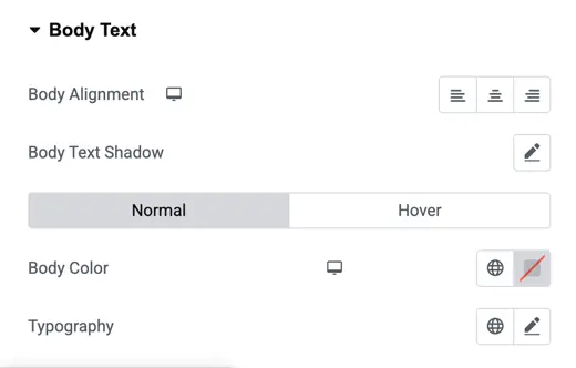
Body text settings
- Body Alignment: Set the text alignment left, center, or right.
- Body Text Shadow: Add a shadow effect to enhance text visibility or style.
- Normal / Hover: Apply different text styles for regular and hover states.
- Body Color: Choose the color of the body text.
- Typography: Adjust font size, family, weight, spacing, etc.