Search for answers or browse our knowledge base.
Promotion Bar
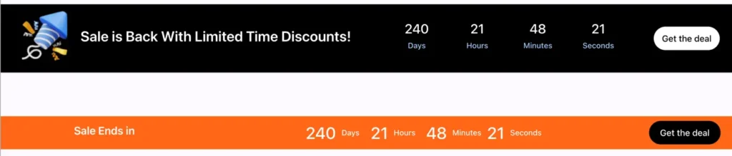
Create urgency and grab attention with the WPMozo Promotion Bar for Elementor. This dynamic countdown banner helps you highlight sales, promotions, and limited-time offers at the top of your site, ensuring your visitors never miss a deal.
This widget comes free with WPMozo Addons Lite. To use it, simply install and activate the free version of plugin.
https://wordpress.org/plugins/wpmozo-addons-lite-for-elementor
How to add widget on page
Once the WPMozo Addons plugin is activated, it introduces several widgets to the Elementor builder. Among them, you can use the Promotion Bar widget by simply dragging and dropping it into your layout. To add the widget, follow these steps:
- Create/edit a page/post that uses Elementor builder.
- Create/edit container.
- Search widget Promotion Bar under WPMozo.
Date and Content
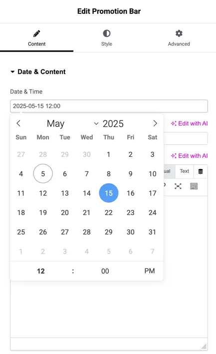
Date and Time
Set a specific end time for your promotion using the intuitive calendar and time selector. This determines when the countdown ends, helping you create time-sensitive campaigns that drive conversions.
Title and description
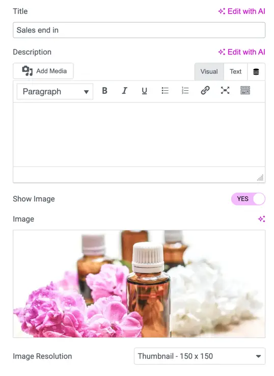
Title
Add a short, compelling headline like “Sales end in” to instantly grab attention. This title appears prominently in the promotion bar.
Description
Use the rich text editor to add a message or context below the title. You can format text, insert links, and enhance the message to fit your campaign needs.
Image display options
Show Image Toggle
Switch the image display ON or OFF as needed. When enabled, you can upload an image that appears alongside your message.
Image Upload & Preview
Upload a promotional image to visually support your offer. This can be a product shot, banner, or any image related to your campaign.
Image Resolution
Choose the image resolution to control the display quality and size. For example, “Thumbnail – 150 x 150” is ideal for compact visuals without affecting performance
Display settings
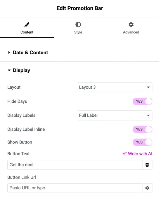
The “Display” section lets you control how the bar looks and work.
- Layout: Pick how your bar looks. Different layouts change the style of the bar.
- Hide Days: This lets you hide the “days” part of a countdown. Set as “YES,” so the days won’t show.
- Display Labels: Choose how labels (like “Days,” “Hours”) appear.
- Display Label Inline: If you pick “YES” here, the labels will sit on the same line as the numbers, not below them.
- Show Button: This decides if a button appears on the bar. Set as “YES,” so a button will show.
- Button Text: This is what the button says. You can change it to anything you like.
- Button Link URL: Add a web link here for where the button takes people when clicked.
Style options
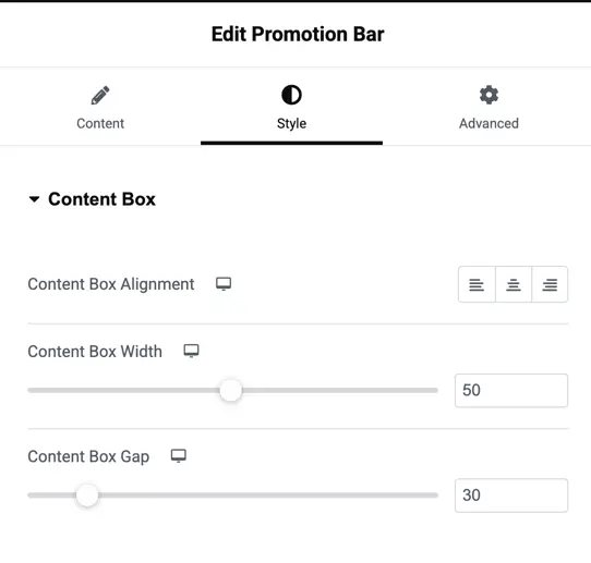
Content box
In the “Style” tab, the “Content Box” section helps you change how the content inside the bar looks.
- Content Box Alignment: This decides where the content sits inside the bar—left, center, or right.
- Content Box Width: This sets how wide the content area is.
- Content Box Gap: This controls the space between different parts inside the bar, like image and countdown.
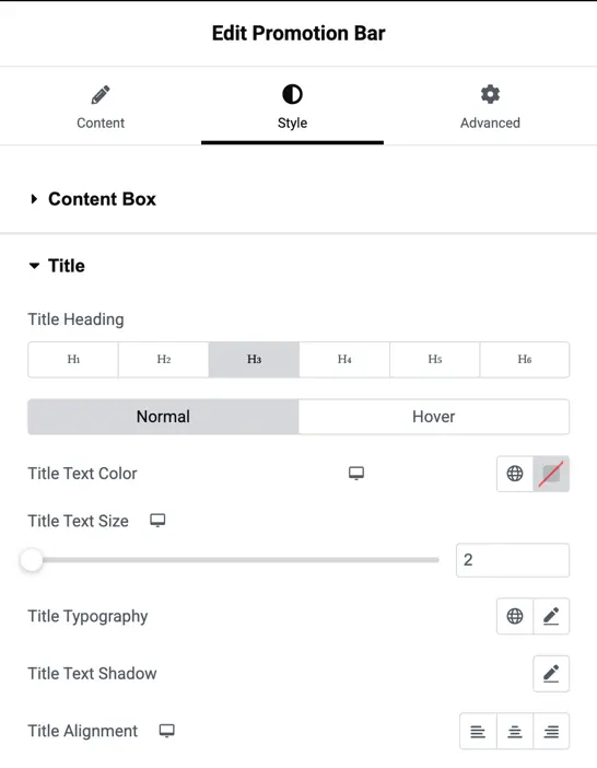
Title customization
In the “Style” tab, the “Title” section helps you change how the title of your bar looks.
- Title Heading: This picks the size of your title, like a heading.
- Normal and Hover Tabs: These tabs let you set how the title looks normally and when someone hovers over it with their mouse.
- Title Text Color: This sets the color of the title text. You can pick a color using the color box shown in the image.
- Title Text Size: This decides how big the title text is.
- Title Typography: This lets you change the font style of the title, like making it bold or italic.
- Title Text Shadow: This adds a shadow behind the title text to make it stand out. You can adjust the shadow using the pencil icon shown in the screenshot below.
- Title Alignment: This decides where the title sits—left, center, or right.
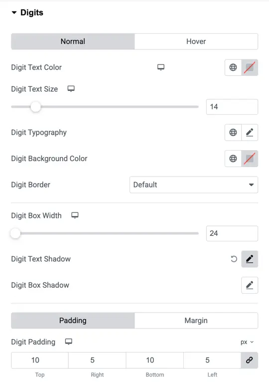
Digits settings
In the “Style” tab, the “Digits” section lets you change how the numbers (like in a countdown) look.
- Normal and Hover Tabs: These tabs let you set how the digits look normally and when someone hovers over them with their mouse.
- Digit Text Color: This sets the color of the numbers. You can pick a color using the color box.
- Digit Text Size: This decides how big the numbers are.
- Digit Typography: This changes the font style of the numbers, like making them bold or italic. The below screenshot shows a pencil icon to edit the font settings.
- Digit Background Color: This sets the color behind the numbers. You can choose a color using the color box in the image.
- Digit Border: This adds a line around the numbers.
- Digit Box Width: This sets how wide the box around each number is.
- Digit Text Shadow: This adds a shadow behind the numbers to make them stand out. You can adjust the shadow using the pencil icon in the image.
- Digit Box Shadow: This adds a shadow behind the box around the numbers. You can change the shadow with the pencil icon shown.
- Digit Padding: This controls the space inside the box around the numbers.
- Digit Margin: This controls the space outside the box around the numbers.
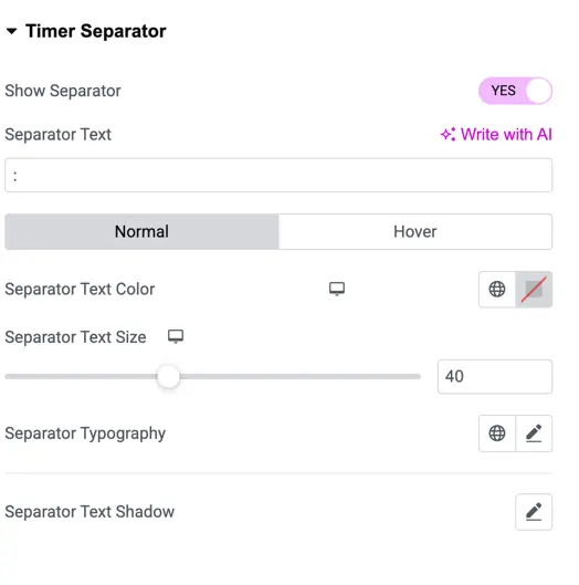
Timer separator settings
The “Timer Separator” section helps you change how the separator (like the “:” between numbers in a timer) looks.
- Show Separator: This decides if the separator shows between the timer numbers. In the image, “YES” is picked, so the separator will show.
- Separator Text: This sets what the separator looks like. In the image, it’s set to “:”, which is the usual symbol for timers. You can change it to something else if you want.
- Normal and Hover Tabs: These tabs let you set how the separator looks normally and when someone hovers over it with their mouse.
- Separator Text Color: This sets the color of the separator.
- Separator Text Size: This decides how big the separator is.
- Separator Typography: This changes the font style of the separator, like making it bold or italic.
- Separator Text Shadow: This adds a shadow behind the separator to make it stand out. You can adjust the shadow using the pencil icon shown in the below screenshot.
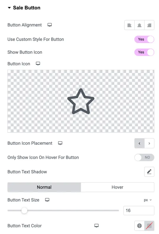
Sale button Settings
The “Sale Button” section lets you customize the button’s look. You can align the button, add a icon, set its position, and choose if the icon shows all the time or only when someone hovers over it. You can also change the button text size, color, and add a shadow to make it pop. These options help you create a button that looks great and fits your website perfectly!