Addons for Elementor Documentation
Search for answers or browse our knowledge base.
Breadcrumbs
This widget comes free with WPMozo Addons Lite. To use it, simply install and activate the free version of plugin.
https://wordpress.org/plugins/wpmozo-addons-lite-for-elementor
How to add widget on page
Once WPMozo Addons is activated it adds a number of widgets to the Elementor builder. To insert the widget, use the following steps.
- Create/edit a page/post that uses Elementor builder.
- Create/edit container.
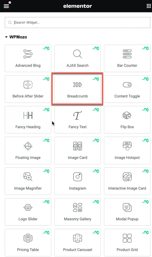
- Search widget Breadcrumbs under WPMozo.
Content
Breadcrumbs are a type of secondary navigation that help users understand their location within the website’s hierarchy.
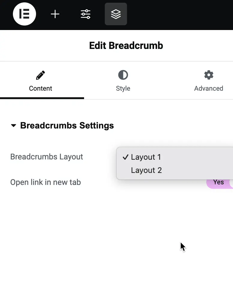
Breadcrumbs settings
Breadcrumbs Layout:
This setting provides two layout options for displaying breadcrumbs on your website.
Style
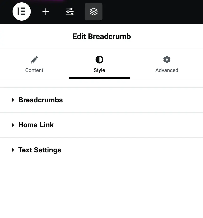
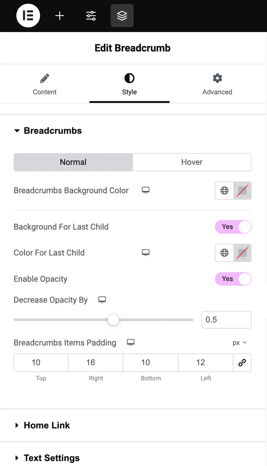
Breadcrumbs style option
Breadcrumbs Background Color
Set the background color of the breadcrumb links.
Background for Last Child
This option allows you to highlight the last item in the breadcrumb (usually the page the user is on). If you turn it on, you can assign a different background color to make the last breadcrumb stand out.
Color for Last Child
Similar to the background, you can set a custom text color for the last breadcrumb in the path to help it stand out.
Enable Opacity
You can add a transparency effect to the breadcrumb links. Turning this on will let you adjust how solid or transparent the breadcrumb appears.
Decrease Opacity By
Use this slider to control how much transparency is applied to the breadcrumb background when opacity is enabled. Lower values make it more transparent.
Breadcrumb Items Padding
You can adjust the spacing around each breadcrumb link by setting padding values. These values (Top, Right, Bottom, and Left) let you create more space around the text, making the breadcrumb links easier to read.
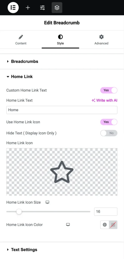
Home link customization
Custom Home Link Text
This option lets you rename the “Home” link in the breadcrumb path. Turn this on if you want to change the default “Home” label to something else.
Home Link Text
This is where you enter the new text for the Home link. For example, if you want it to say “Main Page” instead of “Home,” type that here.
Use Home Link Icon
You can add an icon next to the Home link to make it more visually distinct. For example, you might want to add a house icon.
Hide Text (Display Icon Only)
If you want to show only the icon and not the word “Home,” turn this option on.
Home Link Icon
Select the icon to display next to the Home link. This could be any icon that fits your site’s style.
Home Link Icon Size
Adjust the size of the icon displayed for the Home link. A larger value will make the icon bigger.
Home Link Icon Color
Customize the color of the Home icon to match the theme of your site.
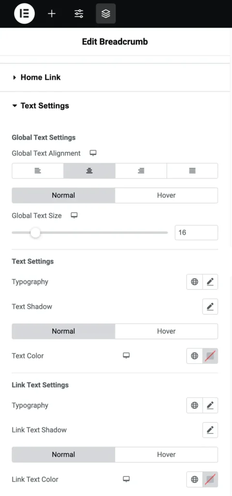
Text settings
Global Text Alignment
This option allows you to choose how the breadcrumb text is aligned (left, center, or right). Pick the one that fits best with your layout.
Global Text Size
Adjust the overall size of the breadcrumb text. A larger number will make the text bigger.
Text Customization Options
Typography
Select a font style for the breadcrumb text. You can choose from various fonts to match your website’s design.
Text Shadow
You can add a shadow effect to the breadcrumb text. This can make the text stand out more.
Text Color
Set the color of the breadcrumb text for normal display.
Link Text Settings
This allows you to customize the style of breadcrumb links.
Typography: Choose the font style for the link text.
Link Text Shadow: Add a shadow effect specifically for the link text to give it more dimension.
Link Text Color: Choose the color for the links in the breadcrumb path.