
Added a button to your site but unsure how to make it stand out? Don’t worry; we’re here to help you display gradients when a user hovers over the button.
Web designers add gradient buttons to websites for several reasons. They might suit the website’s branding or help retain customers with interactive design aesthetics. The new concept of interactive gradient buttons—the appearance of a gradient when a user hovers over the button—leads to a more engaging experience for visitors.
Unlike a simple gradient button, it’s kind of tricky to add these on-hover gradients to buttons on Elementor. That’s why we’re here in this article with a complete guide on creating such gradients in Elementor.
We will demonstrate this with and without the help of a plugin. Let’s begin without any further ado!
What Is a Gradient and Its Semiotics in Web Design
A gradient is basically a mix of two or more colors that blend together to give a unique look.
Back in 2016, Instagram redesigned its logo with a gradient of multiple colors blending together to give an energetic vibe. Following its success, the web design industry soon adopted the trend of gradients.
Not only do gradients look cooler, but they are also quite effective when it comes to customer retention. An Enterprise Apps Today statistic says 58% of users prefer aesthetically pleasing websites.
Effect of Interactive Gradients on Buttons
The sole purpose of a button on your website is to drive conversions. That’s why it needs to be tempting and appealing to visitors.
Having a plain button can be seen as vague, failing to appeal to potential customers. However, if you design the button carefully, it might have a stronger effect on the visitor.
Especially, adding gradients that follow the semiotics of web design to a button significantly improves its visual appeal. Using gradients in web design can increase the customer retention by 15-30%.
Additionally, if the gradient appears when the visitor hovers over a button, they will be more likely to engage with other buttons on the web page. And ultimately clicking on the desired CTA button to drive a conversion!
Adding Gradient to a Button in Elementor
Look, it’s all really simple to add a gradient to a button in Elementor. You don’t have to be a tech geek to do all of this. Just follow these simple steps, and you will have it.
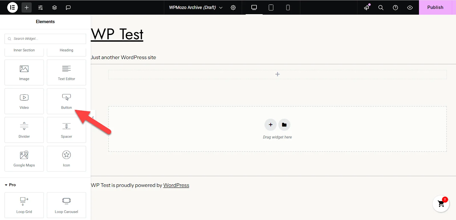
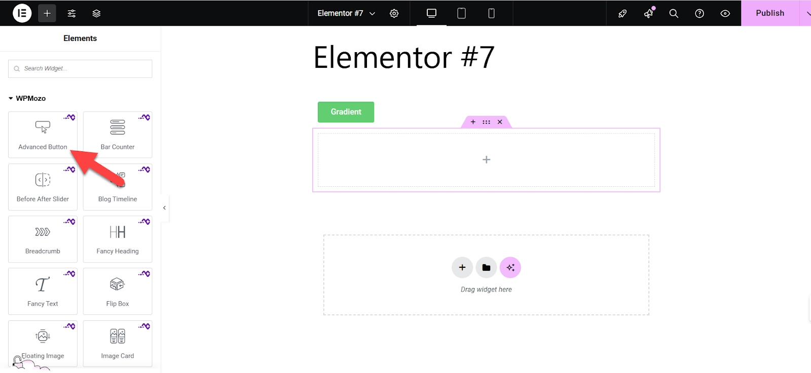
- First, go to the Elementor editor on your website and start inserting elements into the web page. Look for the “Button” widget on the menu on the left side.
- Once you find that, click on it to insert a button. Half the job is done here.
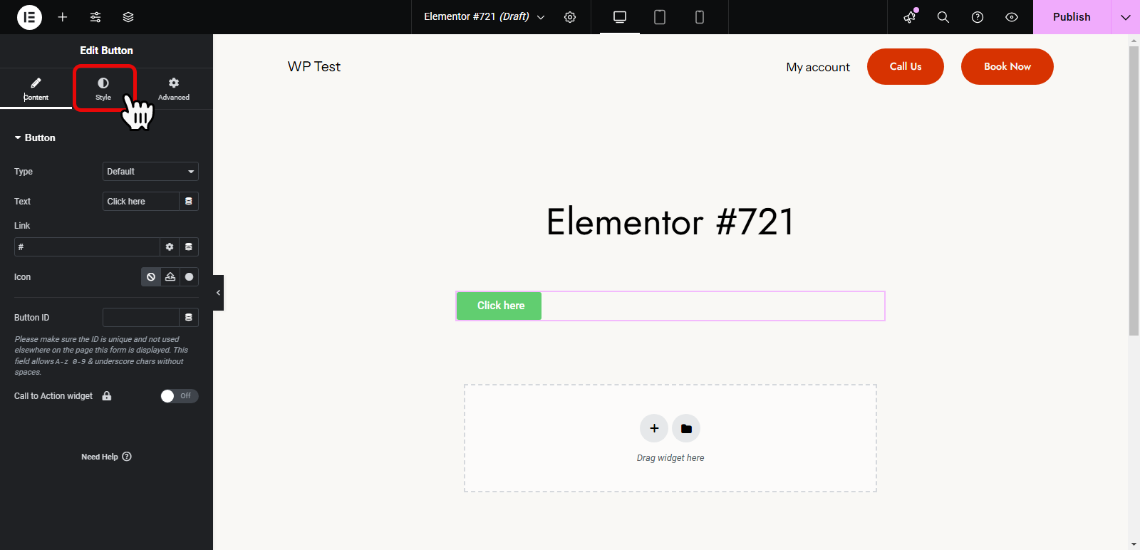
- Next, click on the “Style” tab from the menu, as shown in the screenshot below.
- After going to the style tab, locate the Background Type option and click on the highlighted option in the screenshot below.
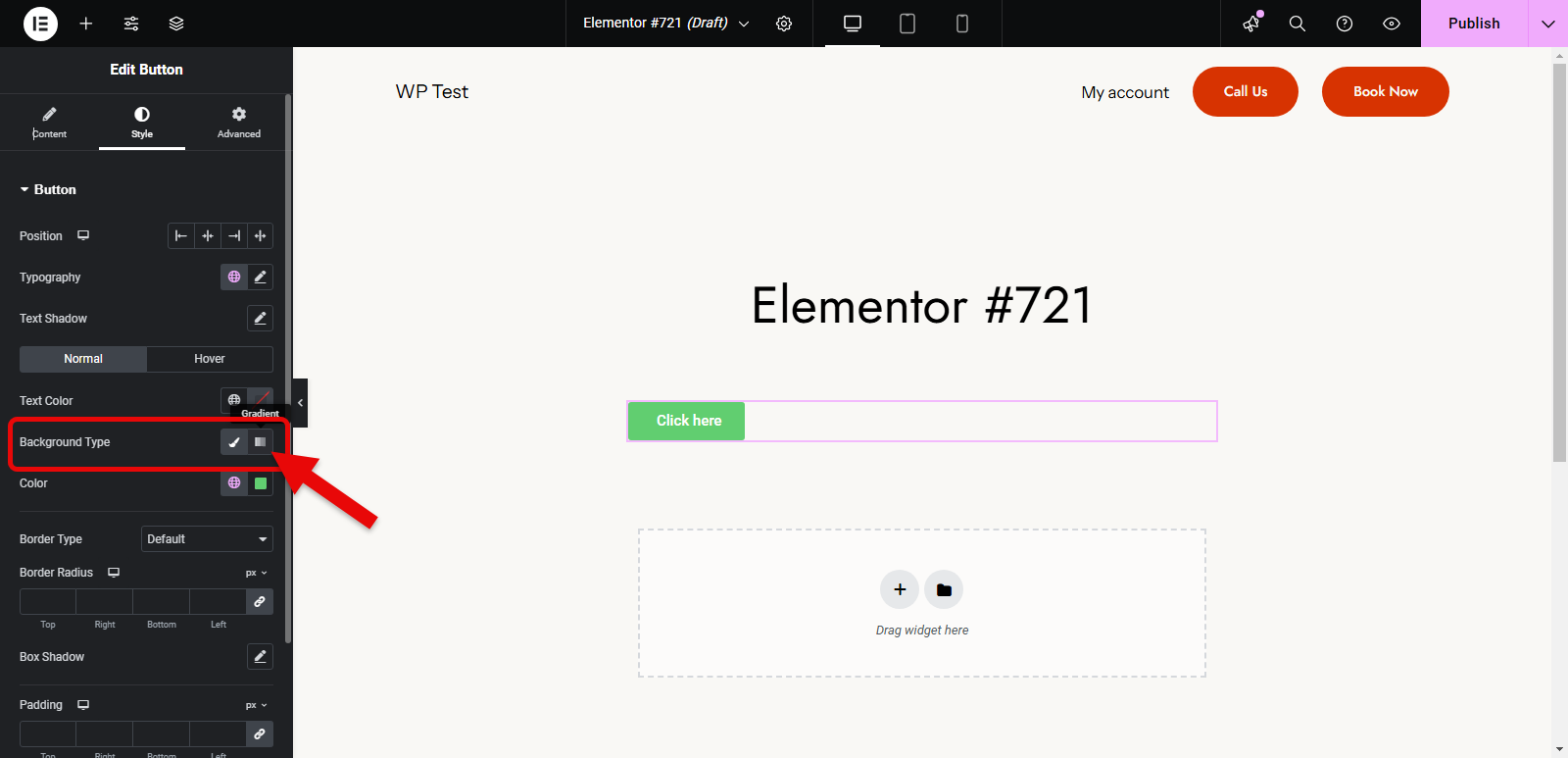
Clicking on it will add the intended gradient to your button.
- After this, you can choose from different color combinations to customize the gradient.
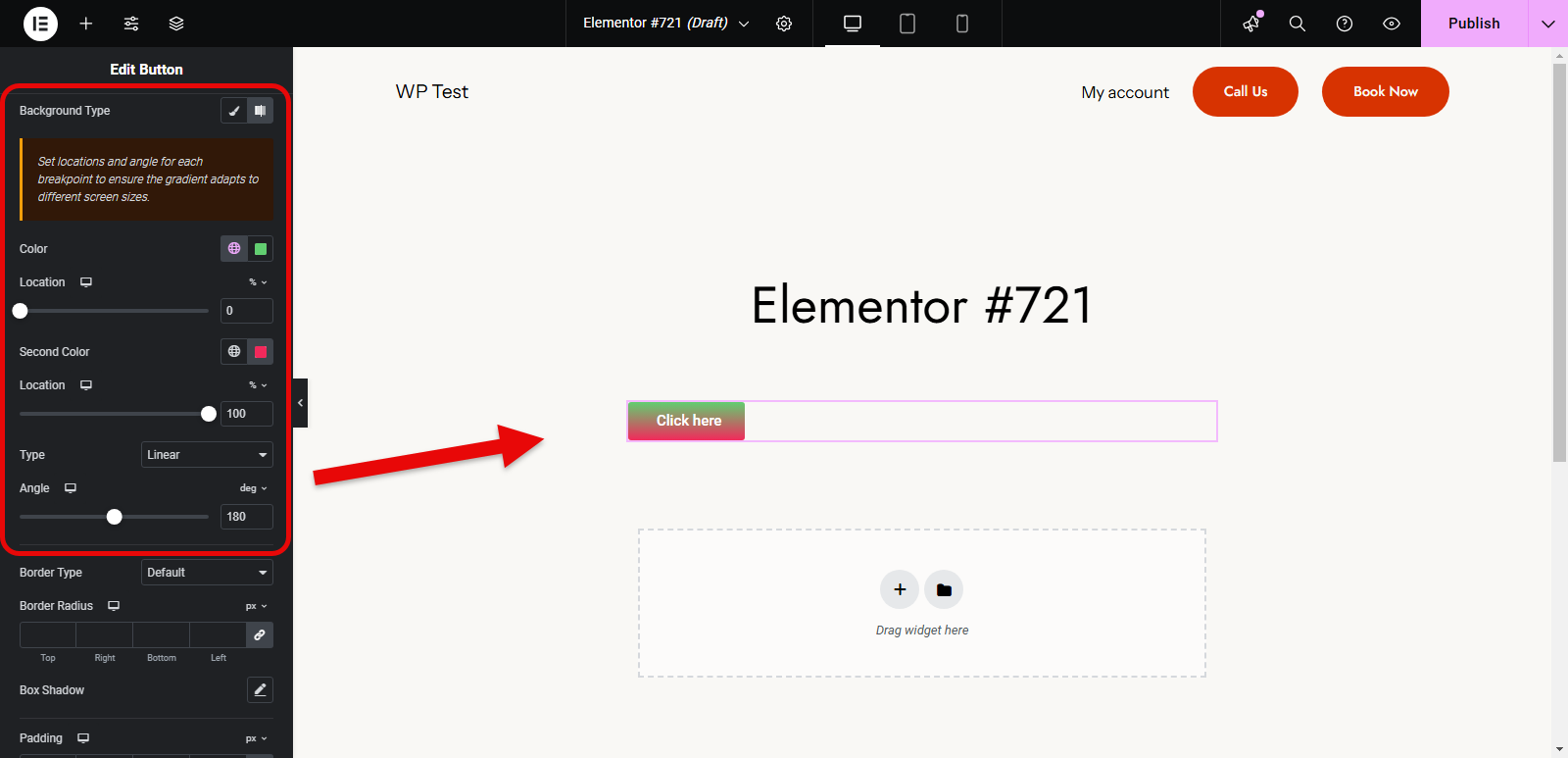
- Slide below, and you will find more customization options for the gradient button, as the attached screenshot shows.
In short, this is how you decorate the button with pleasing aesthetics to make it more appealing to customers. But if you want to take it a step further and add the on-hover gradient button, things are not as simple there.
Continue reading to learn more about it.
Adding On-hover Gradient Button in Elementor (Using Custom CSS)
By default, Elementor offers the option to add a gradient to a button when users hover over it. You simply need to change the style tab from Normal to Hover.
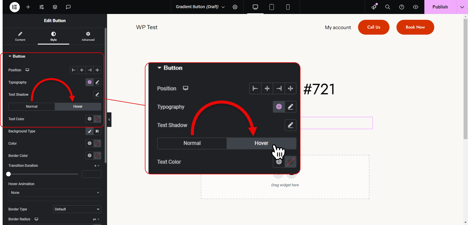
Now, all the customizations you’ll apply on the button, will be for the hover effect.
But in some cases, you might want to use a custom CSS. For example, if you have multiple buttons across your site and want to make sure of uniform hover effects, then using a custom CSS can centralize the styling. With this, you’ll avoid manually configuring the hover effect for each button.
Yes, with the Elementor Global feature, you can easily use a single element multiple times on different locations of a website, but what if some themes or external stylesheets override Elementor’s built-in options? The breaking of the layout. Thus, by using custom CSS to add an on-hover gradient, you can help enforce specific styles and resolve such conflicts.
Let’s see how to do that. Follow these steps to get it done.
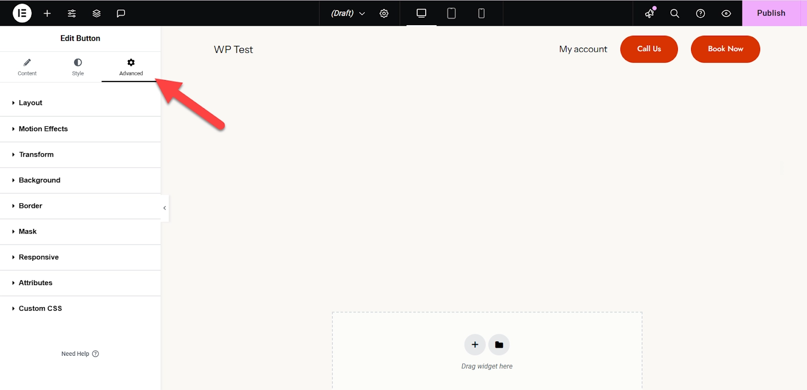
First, insert a button by going to the Insert Widget menu in Elementor.
After setting up the basics, go to the advanced tab, as shown in the screenshot below.
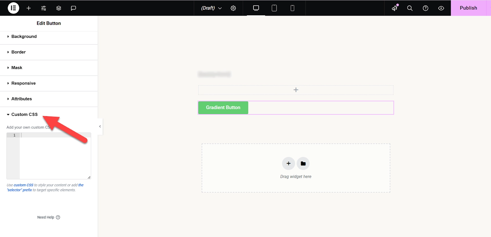
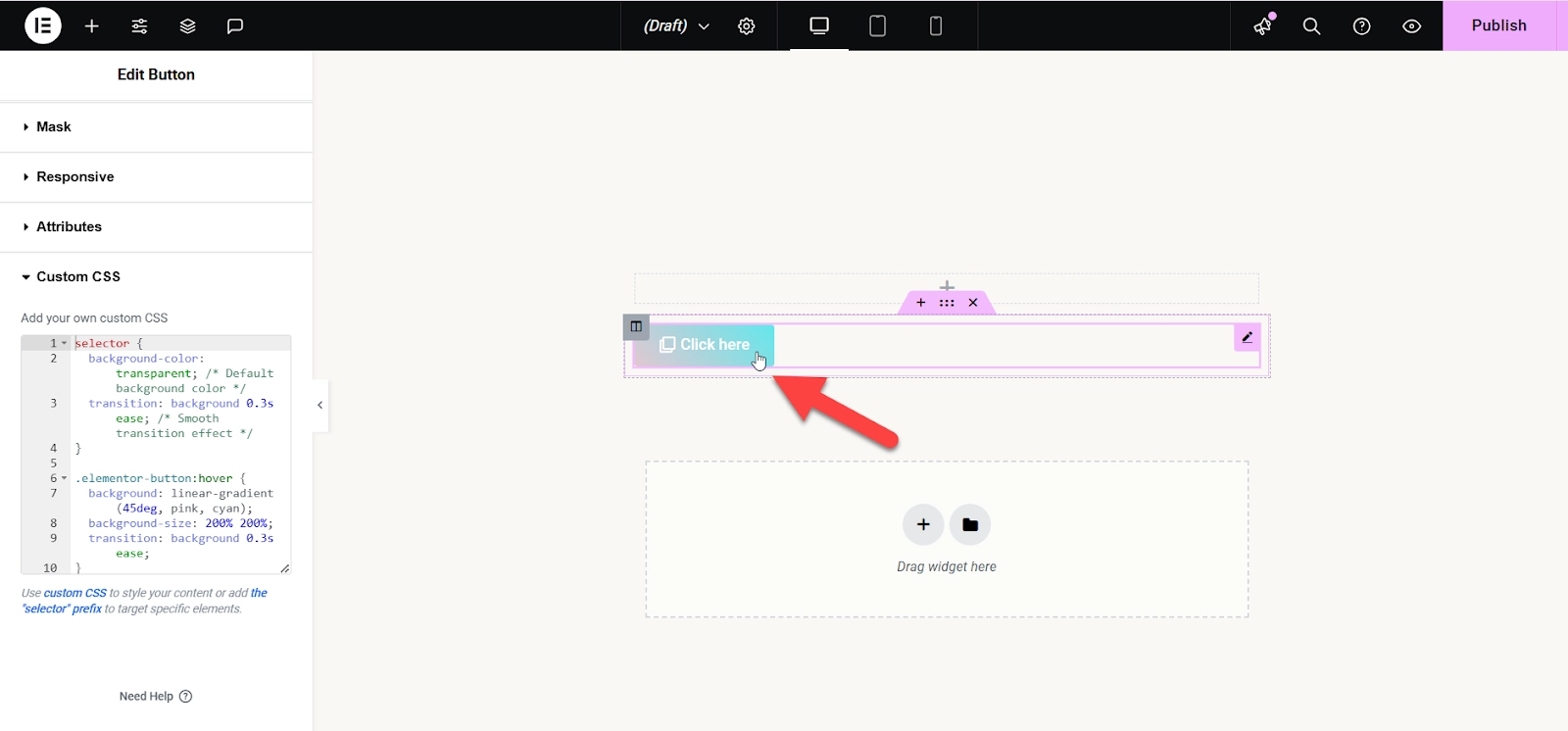
Scroll below and click on the Custom CSS option to add the gradient.
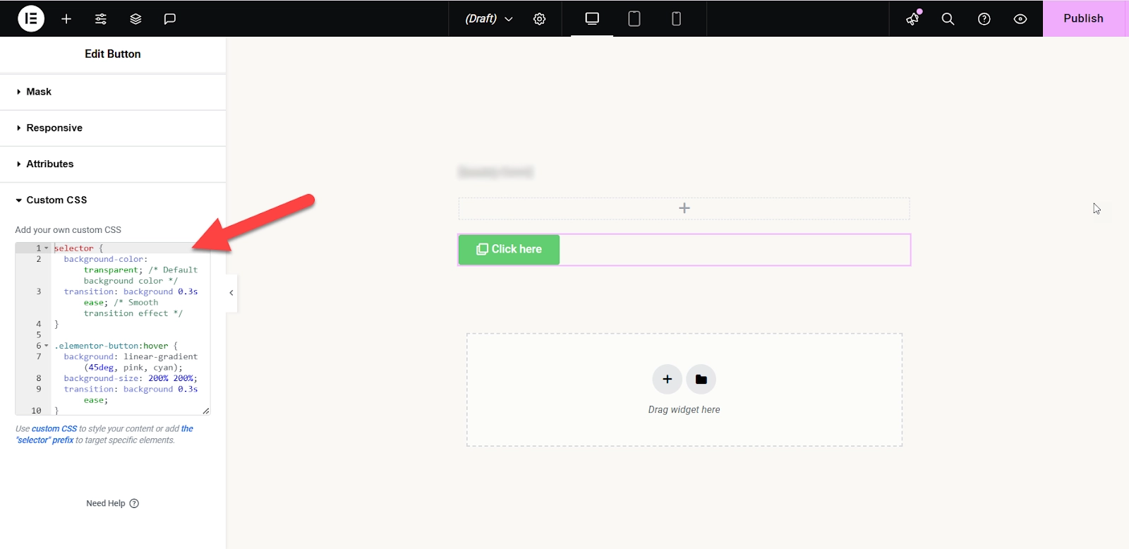
Copy the custom CSS code for the gradient buttons given below.
selector {
  background-color: transparent; /* Default background color */
  transition: background 0.3s ease; /* Smooth transition effect */
}

.elementor-button:hover {
  background: linear-gradient(45deg, pink, cyan);
  background-size: 200% 200%;
  transition: background 0.3s ease;
}
Now paste it into the box as shown in the attached screenshot.
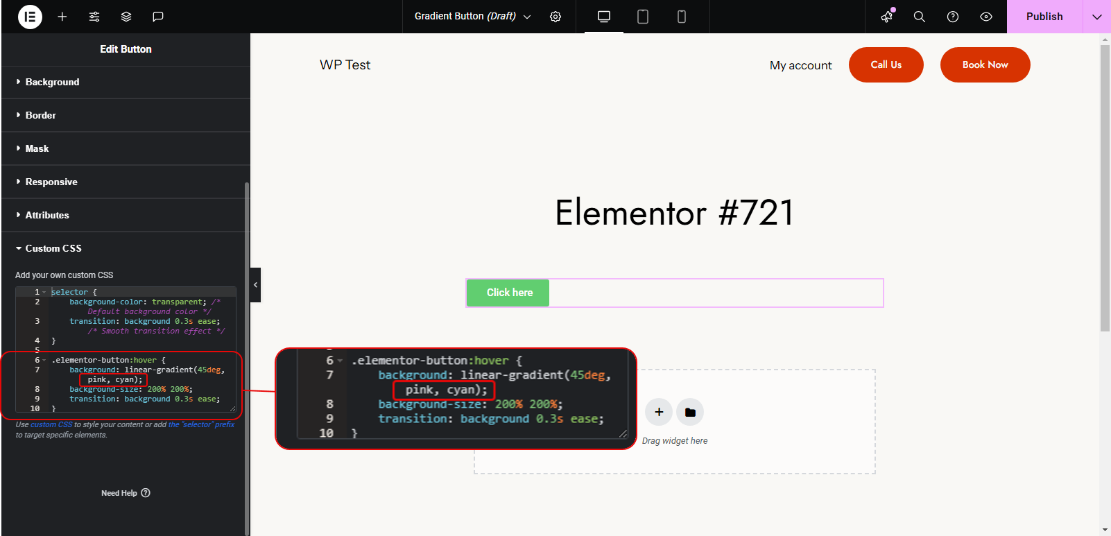
And finally, see the gradient in action by hovering over the button. Here is a screenshot that shows the final result.
If you want to change colors, replace the color names highlighted in the below screenshot with those of your desired colors.
And that’s how you can add hovering gradient buttons to Elementor without using the built-in feature.
Adding Gradient Button in Elementor Using a Plugin (Advanced On-hover Gradient Styles)
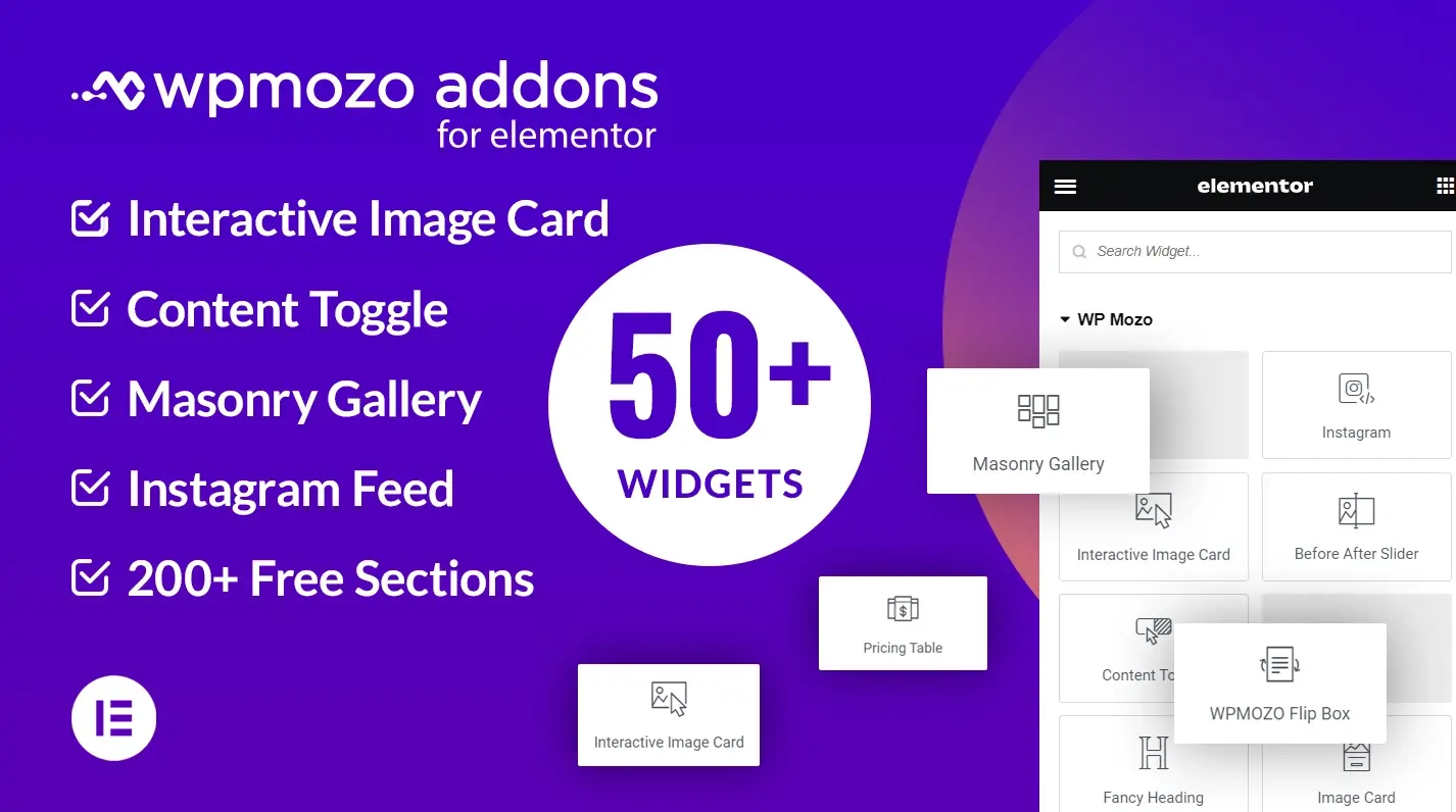
Here, we will use the WPMozo Addons for Elementor plugin to add an on-hover gradient button in Elementor easily.
WPMozo Addons for Elementor
The WPMozo Addons for Elementor plugin offers advanced widgets for Elementor. These widgets also include the Advanced Button widget with advanced animations and other design options.
Using this Elementor button widget by WPMozo, you can create and customize buttons in multiple ways, such as solid borders, transparent backgrounds, and double shutters.
The widget option we will need for this article is the gradient on hover button shown in the screenshot below.
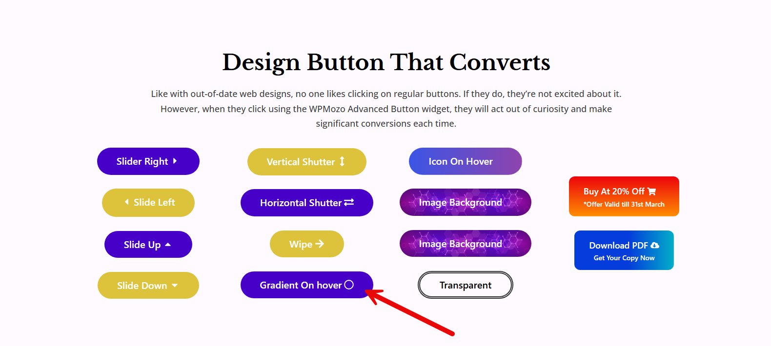
This button gives a static look normally. But when a cursor is hovered over it, the gradient appears in a smooth animation that also looks satisfactory. This tempts visitors to interact with CTA buttons on your website.
Step-by-step Guide to Use the Gradient on Hover Widget
Follow these steps to insert the gradient-on-hover button into Elementor.
First, go to the Elementor editor and open the menu to insert widgets. Then, scroll to the bottom, where WPMozo’s addons are displayed.
Now, you will locate the Advanced Button widget and insert it into the web page.
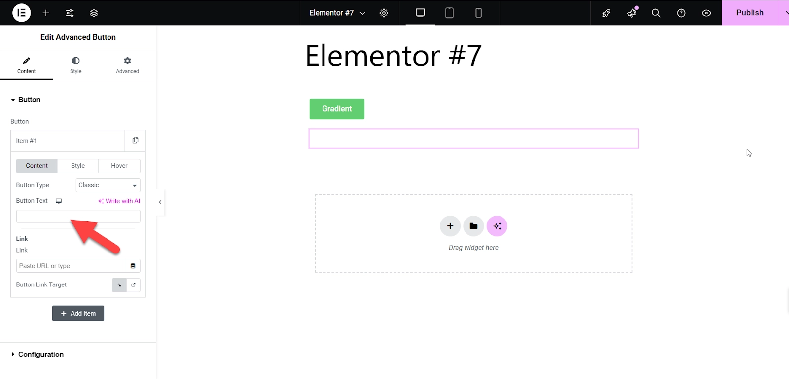
In the next step, add custom text and apply other settings of your button such as Button Type, Link, and the Link Target.
Once this is all done, click on the Hover menu as shown in the screenshot below.
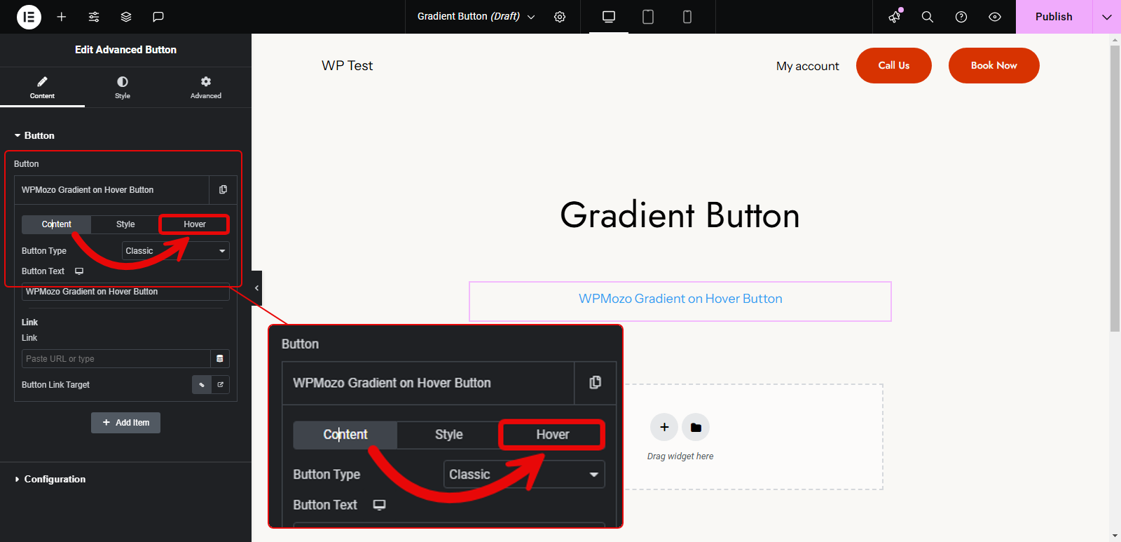
Here, you get the options to apply on-hover gradient to the button, as well as the style to show it. In order to add gradient, select the Gradient icon next to the Background Type. As soon as you do that, it will open the color options.
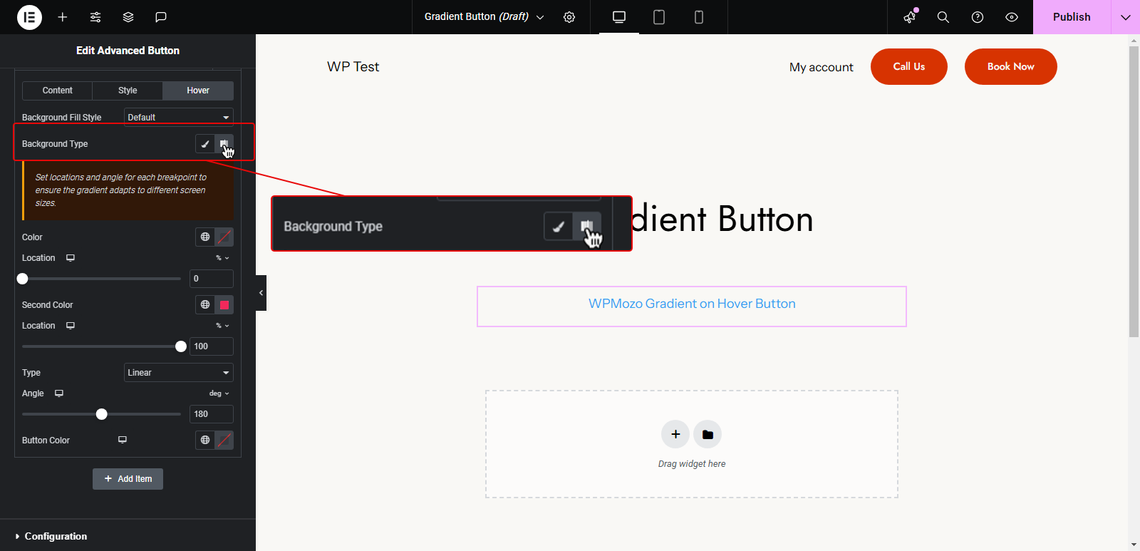
First, select the first color and set its location by sliding the progress bar. Then, do the same with Second Color.
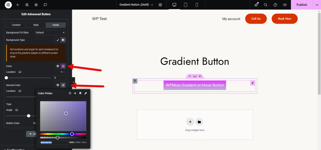
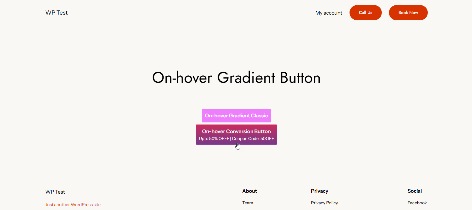
After adding the color, you can select the gradient Type as Liner or Radial. Based on the gradient type, apply the customizations, and once you’re done, the button with on-hover gradient will be like the following:
Apply Gradient Animation Style
The best thing about Advanced Button widget by WPMozo is that, you can animate the on-hover gradient, adding an extra layer of interactivity. So, if you want to apply the style, simply head to the Background Fill Style and select available style from the list. Based on your selection, the button gradient will animate as follows:
Looks interesting, right? But that’s not all you can do with the on-hover gradient button in Elementor. There’s more that the WPMozo widget provides.
Do More With Your On-Hover Gradient Elementor Button
The Advanced Button widget of WPMozo lets you do more with your “on-hover gradient Elementor button.” You can:
- Apply different layouts, such as Classic and Conversion.
- Add multiple buttons together: Inline or stacked
- Customize Row and Column spacing
And there’s more you can do with the Elementor button you create using the Advanced Button widget of WPMozo.
Wrapping Up
Web design is all about aesthetics and captive attractions on a website that drive conversions. Gradients have become an essential part of the web design language as of late.
Web designers use gradients to brand web pages and design CTA buttons. However, some people want to make these buttons more interactive by adding buttons that display a gradient after the user hovers over it.
This article provides a complete guide on how to do just that.
We have covered the step-by-step procedure of adding gradients both with and without the help of external add-ons in Elementor.
Now, it’s your turn to try that out.


0 Comments