WPMozo Addons for Elementor Documentation
Search for answers or browse our knowledge base.
Horizontal Scrolling Cards
The Horizontal Scrolling Card Widget allows you to display content in stylish horizontal cards with smooth scrolling effects. Each card can include a title, description, image, and tags, making it a versatile option for showcasing products, services, or portfolios.
Once WPMozo Addons is activated it adds a number of widgets to the Elementor builder. To insert the widget, use the following steps.
- Create/edit a page/post that uses Elementor builder.
- Create/edit container.
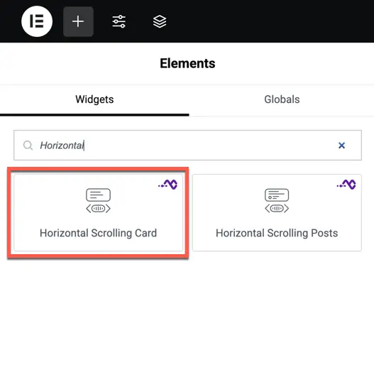
- Search widget Horizontal Scrolling Cards under WPMozo.
Content settings
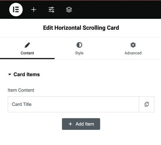
- Card Items
- Click Add Item to create a new card.
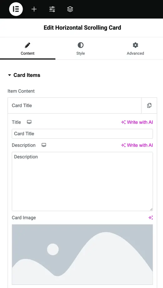
- Each card comes with individual settings for Title, Description, and Image.
- Card Title
Enter and customize the card’s title text. - Description
Add supporting content for the card. - Card Image
Upload or choose an image for the card.
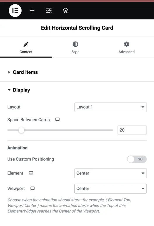
Display settings
- Layout
Choose between Layout 1 or Layout 2 for different card arrangements. - Space Between Cards
Adjust the spacing (in pixels) between cards for proper alignment. - Animation
Add scroll animations to the cards. - Use Custom Positioning
Enable or disable manual positioning of elements within the card. - Element & Viewport Trigger
Choose when the animation starts by setting the Element position (Top, Center, Bottom) and Viewport position (Top, Center, Bottom).
Example: Element Top, Viewport Center means the animation begins when the top of the card element reaches the center of the viewport.
Style settings
Card Image
- Padding – Adjust inner spacing around the image.
- Enable Custom Height – Set a fixed custom height for card images.
- Height – Control image height manually when custom height is enabled.
- Border Type & Radius – Select border style and apply rounded corners.
- Box Shadow – Add depth with shadow effects.
Title
- Heading Level – Choose heading tags (H1–H6).
- Color – Set normal and hover colors for the title.
- Typography – Control font, weight, size, and more.
- Alignment – Align text (Left, Center, Right).
- Text Shadow – Apply shadow effects to the title text.
Description
- Color – Set normal and hover colors for the description.
- Typography – Customize font and size.
- Alignment – Adjust description alignment.
- Text Shadow – Add shadow for emphasis.
Tag
- Add and style card tags as per your design needs.