What the WPMozo Fancy Heading Widget Does
This approach is useful when a heading needs visual hierarchy within itself. For example, a section title like “Introducing the New Service” can render with “Introducing” as small pre-heading text, “the New Service” as large bold main heading text, and a descriptive subtitle as post-heading text below, all controlled in one widget instead of stacking three separate Elementor widgets.
The widget includes layout options for inline display (all three parts on one row) or stacked display (each part on its own line), full typography control per segment, and background styling that applies to the whole heading container.
Key Features
- Three-part heading structure: pre-heading, main heading, post-heading
- Independent styling for each heading segment
- Inline layout (single row) or stacked layout (vertical)
- Background support: solid color, gradient, or image
- Heading tag selection per segment (H1 through H6) for semantic control
- Typography controls per segment: font family, size, weight, style, line height, letter spacing
- Color control per segment for normal and any hover state
- Text alignment per segment (left, center, right, justify)
- Padding and margin controls for the heading container
- Responsive controls for tablet and mobile breakpoints
- Compatible with Elementor free and Elementor Pro
- No code required for any styling option
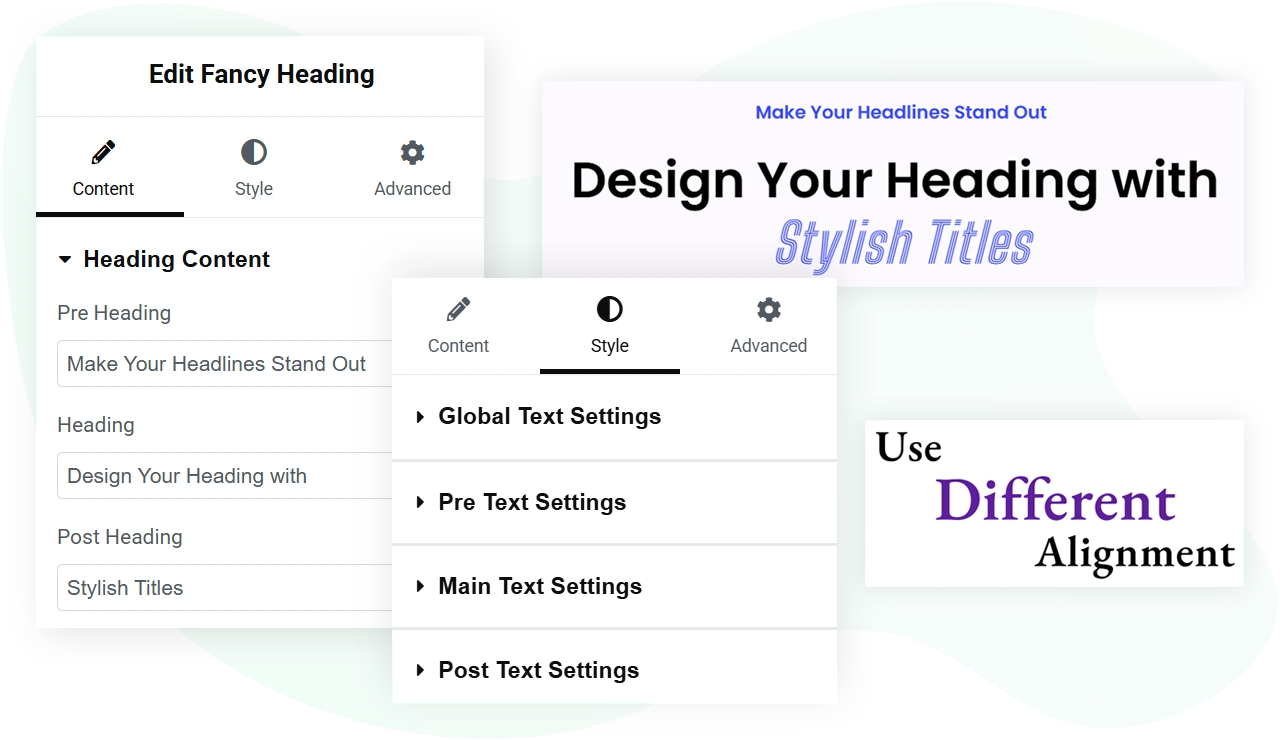
Layout Options: Inline and Stacked
Inline layout. All three heading segments render on the same line, left to right: pre-heading, main heading, post-heading. Use this when the segments are short and read as one continuous phrase. Common applications include navigation-style headings, breadcrumb-style section titles, and headings where the pre and post segments are short qualifiers like “New” or “Free” framing the main term.
Stacked layout.> Each heading segment renders on its own line, top to bottom: pre-heading, main heading, post-heading. Use this when the segments are independent thoughts or when the main heading needs visual emphasis with smaller supporting text above and below. Common applications include hero section titles, marketing page intros, and editorial-style article headers.
Switching between the two layouts is a single dropdown setting in the Elementor panel. The choice is purely visual and does not affect the underlying HTML structure beyond the wrapper element.
Styling Options per Heading Segment
Each of the three heading segments has its own complete set of styling controls. Settings live under the Style tab in the Elementor panel.
Typography. Font family, font size, font weight, font style (italic, oblique), text transform (uppercase, lowercase, capitalize), text decoration (underline, line-through), line height, and letter spacing. All controls are independent per segment, so the pre-heading can use a different font than the main heading.
Color. Solid color picker per segment for the normal state. Optional hover-state color for interactive headings (such as headings inside linked containers).
Alignment. Left, center, right, or justify per segment. In stacked layout, each segment can have its own alignment for asymmetric designs.
Spacing. Margin top and margin bottom per segment to control space between the parts when in stacked layout, or to add breathing room in inline layout.
Heading tag. Select H1 through H6 per segment for semantic structure. The main heading typically uses H2 or H3 on inner pages, while the pre and post can be styled as paragraph text or smaller heading levels for SEO accessibility.
Image placement: existing “Separate heading styling options for ease” image stays. Update alt text to “Per-segment typography and color controls for the Fancy Heading widget”.
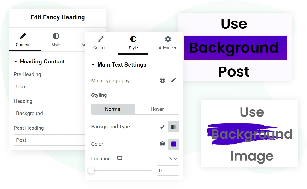
Background Options for the Heading Container
Background types. Three options:
- Solid color: any hex, RGB, or RGBA value
- Gradient: linear or radial gradient with multiple color stops
- Image: upload an image with control over position, size, repeat behavior, and overlay opacity
Padding controls. Padding inside the heading container controls how much space sits between the background edge and the heading text. Useful for creating visually balanced hero blocks.
Border and corners. Optional border styling (width, color, type) and border radius for rounded corner effects. Apply these to make the heading container look like a card or button-style element when the design calls for it.
Box shadow. Optional shadow effect with control over color, blur, spread, and offset. Useful for creating depth on hero sections.
Image placement: existing background usage image stays. Update alt text to “Background image and gradient options for the Fancy Heading widget”.
Common Use Cases
The three-part heading structure works well for the following situations:
Hero section titles. Pre-heading: short tag like “Announcing” or “New release”. Main heading: the primary message. Post-heading: a one-line subtitle or call to action. Stacked layout with center alignment.
Section intros on long pages. Pre-heading: section number or label like “Chapter 02”. Main heading: the chapter title. Post-heading: a one-line summary. Stacked layout.
Pricing table headers. Pre-heading: plan name like “Pro” or “Annual”. Main heading: the price. Post-heading: billing frequency. Inline layout with center alignment.
Editorial post titles. Pre-heading: category like “Tutorial” or “Case Study”. Main heading: the post title. Post-heading: author and date. Stacked layout with left alignment.
Product feature headlines. Pre-heading: feature category. Main heading: the feature name. Post-heading: one-line benefit. Used in feature comparison sections or product landing pages.
Requirements
Plugin version. The Fancy Heading widget is included in both the free and Pro versions of WPMozo Addons for Elementor. No purchase required for basic usage. Pro version users get the same widget with additional pre-built section templates that use Fancy Heading.
Elementor version. Compatible with Elementor 3.0 and above. Works with both Elementor free and Elementor Pro.
WordPress version. WordPress 6.0 or above.
PHP version. PHP 7.4 or above. PHP 8.0 or higher recommended for performance.
Theme compatibility. Works with any WordPress theme that supports Elementor. No theme-specific dependencies.
Browser support. Modern browsers (Chrome, Firefox, Safari, Edge) on desktop, tablet, and mobile.
Related Resources
Building with the Gutenberg block editor instead of Elementor? Use the Fancy Heading block for Gutenberg which provides the same three-part heading structure for block-themed WordPress sites.