
Image Hotspot
This documentation provides a comprehensive guide to all the settings and customization options available in the Image Hotspot block for the WordPress Block Editor.
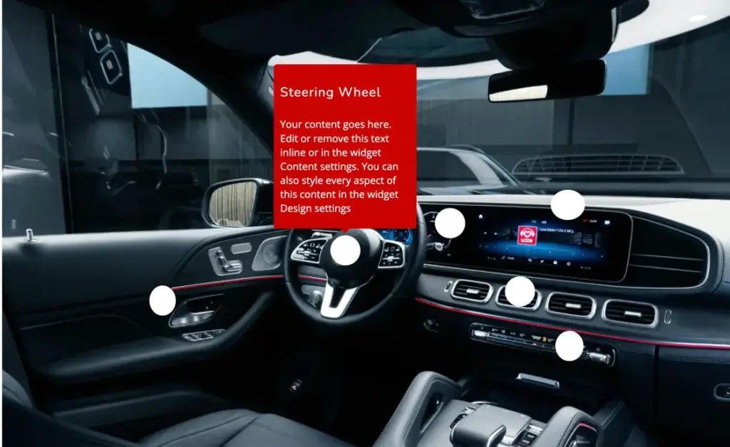
General settings — Hotspot content
The Hotspot Content panel under the General tab allows you to upload and manage the primary base image over which all interactive hotspot markers will be positioned:
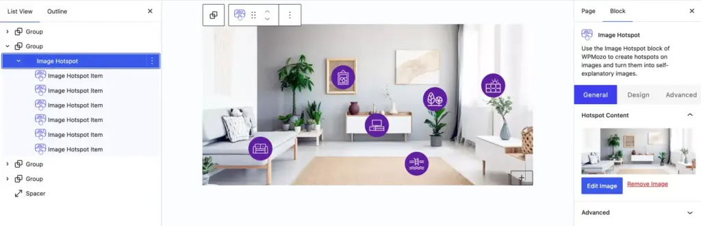
- Image Preview: Displays a real-time thumbnail preview of the selected background image.
- Edit Image: Click this button to open the WordPress Media Library to choose, replace, or crop the base image.
- Remove Image: Click this link to delete the currently selected image from the block container.
Image hotspot item
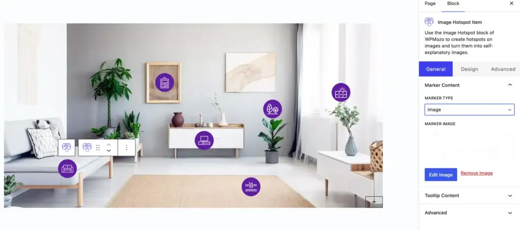
Marker content
- Marker Type: Select the visual style format for the hotspot pointer marker. Available options include:
- Icon: Displays a vector icon as the hotspot marker. Selecting this option reveals icon search and picker controls.
- Text: Displays a text string or number label (e.g., 1, Info, Buy Now) as the hotspot marker.
- Image: Displays a custom graphic or uploaded icon image as the hotspot marker.
- Marker Image:(Available when Marker Type is set to Image) Upload and manage the custom graphic image used for the marker pointer:
- Edit Image: Click to open the WordPress Media Library to upload or select a new marker icon image.
- Remove Image: Click to remove the currently assigned marker image.
Tooltip content
- Tooltip Content: Configures the content overlay (tooltip/popover) that appears when a visitor interacts with this specific hotspot marker. You can add text headings, body text, custom buttons, or nest inner Gutenberg blocks inside the tooltip.
Marker styling
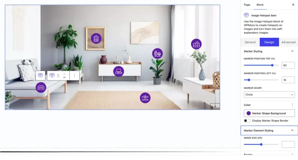
- Marker Position Top (%): Adjust the vertical positioning of the hotspot marker from the top edge of the base image using a percentage value (e.g.,
82%). - Marker Position Left (%): Adjust the horizontal positioning of the hotspot marker from the left edge of the base image using a percentage value (e.g.,
15%). - Marker Shape: Choose the background shape container for the hotspot marker. Available options include:
- Circle: Renders the marker background as a complete circle.
- Square: Renders the marker background as a sharp-cornered square.
- Rounded Square: Renders the marker background with slightly rounded corners.
- Custom: Allows custom shape radius configurations.
- Marker Shape Background: Set the background fill color for the marker shape badge.
- Display Marker Shape Border: Toggle to enable a border around the marker shape. When enabled, options for border color, border style, and border width appear.
Marker element styling
- Image Size (px): Adjust the width and height of the marker image or icon in pixels using the slider or input box.
- Border: Configure border style, border width, and color specifically for the inner marker icon or image element.
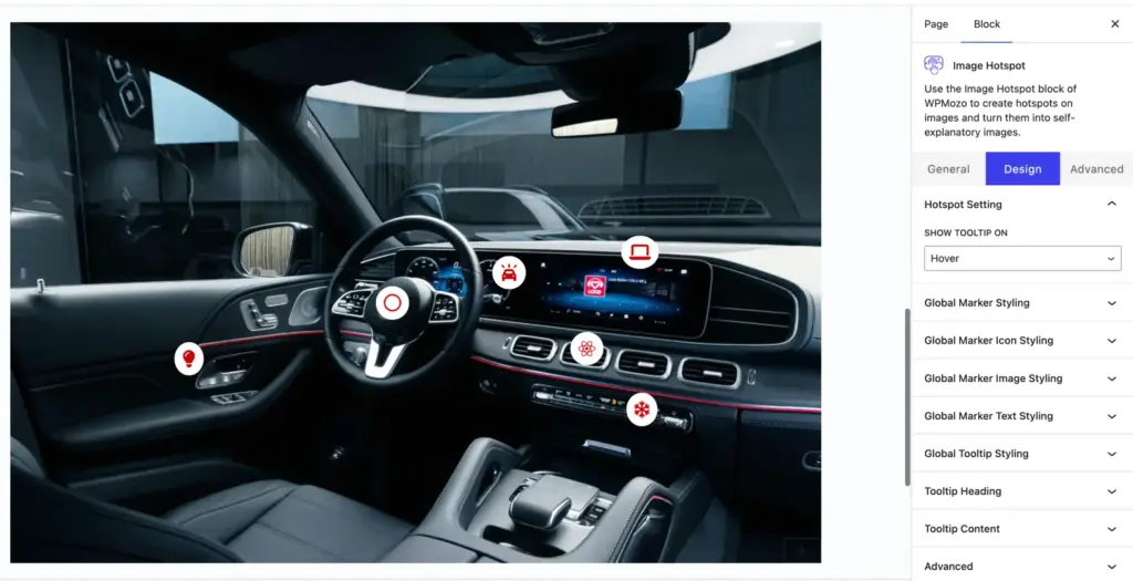
Hotspot setting
- Show Tooltip On: Choose the interaction trigger that displays the tooltip overlay when a visitor engages with a marker:
- Hover: Displays the tooltip overlay automatically when the mouse cursor hovers over the marker.
- Click: Displays the tooltip overlay only when the visitor clicks on the marker.
Global marker styling
- Marker Shape: Set the default shape container for all hotspot markers across the image (Circle, Square, Rounded Square).
- Marker Background Color: Choose the default background fill color for marker badges.
- Marker Border & Radius: Configure global border width, border color, border style (Solid, Dashed, Dotted), and rounded corner radius for all markers.
Global marker icon styling
- Icon Color and Active Color: Set the default icon color for normal and active/hover states across all icon-based markers.
- Icon Font Size: Adjust the global icon size in pixels (
px) for all icon markers.
Global marker image styling
- Image Size: Set the default width and height in pixels (
px) for custom image-based markers. - Image Border & Radius: Apply border width, border color, and rounded corners (
border-radius) to image-based markers.
Global marker text Styling
- Typography Controls: Customize font family, font weight, line height, letter spacing, and text transform for text/number-based markers.
- Text Color & Font Size: Set the text color and font size (
px) for text-based markers.
Global tooltip styling
- Tooltip Background: Set a custom background fill color or gradient for the tooltip container.
- Tooltip Width & Padding: Set the maximum tooltip width (
px) and adjust internal padding (Top, Right, Bottom, Left). - Border & Box Shadow: Configure container border style, rounded corners (
border-radius), and drop-shadow effects for tooltips.
Tooltip heading
- Heading Typography: Customize font family, font size (
px), font weight, line height, and text alignment for tooltip headings. - Heading Color: Set the text color for the title/heading inside tooltips.
Tooltip content
- Content Typography: Configure font family, font size (
px), font weight, line height, and text alignment for tooltip description text. - Content Color: Set the body text color for content inside tooltips.