
Advanced Tabs
This document provides a reference guide defining all the configuration options, layout settings, and design controls available in the WordPress Block Editor.
Configuration
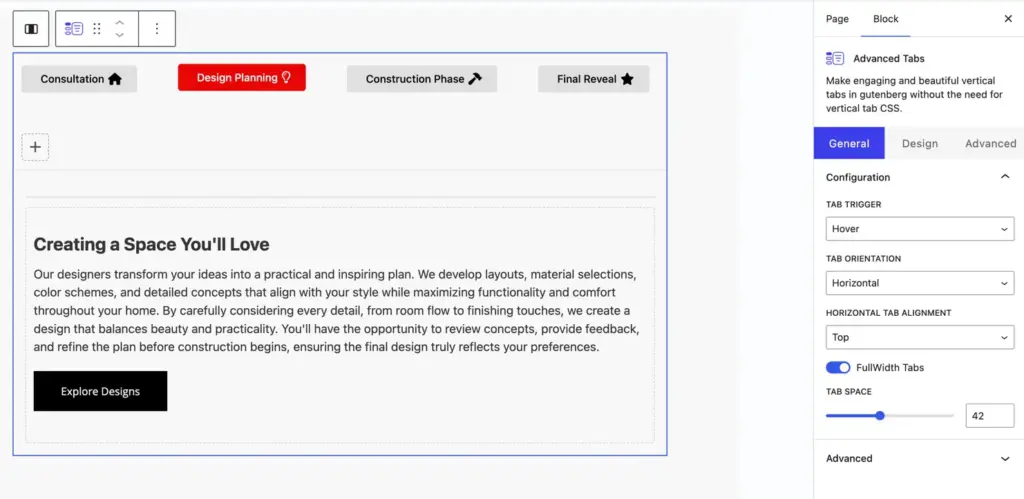
- Tab Trigger: Select whether tabs switch on mouse Hover or Click.
- Tab Orientation: Choose the layout direction for tab headers—Horizontal (row) or Vertical (column).
- Horizontal Tab Alignment: (Horizontal Mode) Set the tab buttons position to Top or Bottom relative to the tab content.
- FullWidth Tabs: Enable this toggle to stretch tab buttons equally across the total container width.
- Tab Space: Adjust the spacing/gap between individual tab buttons in pixels using the slider.
Advanced tabs item
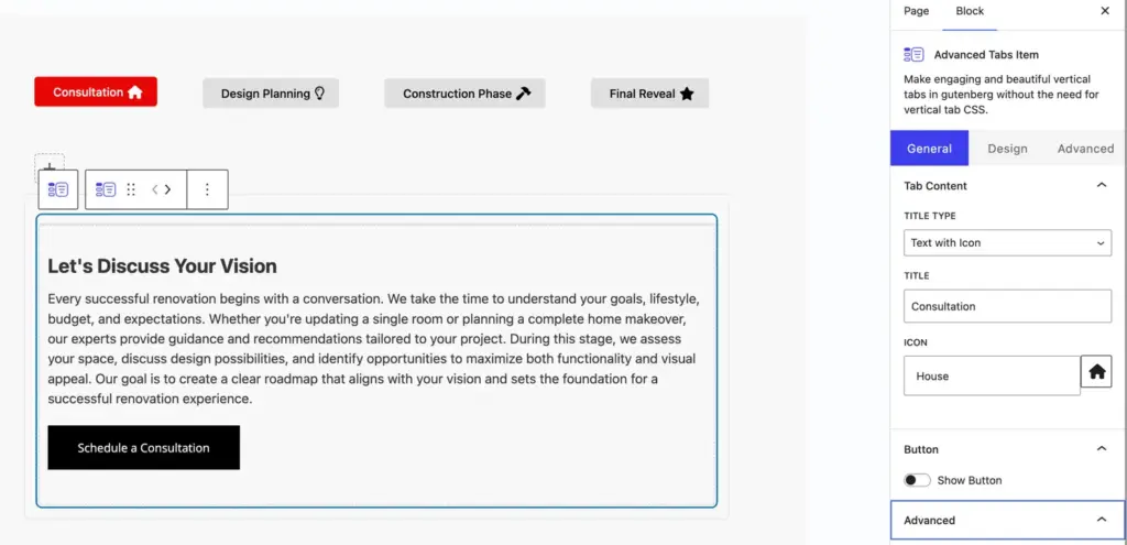
Tab content
- Title Type: Choose how the tab header title is displayed. Available options include:
- Text: Displays title text only.
- Text with Icon: Displays title text along with an icon.
- Text with Image: Displays title text along with a custom uploaded image.
- Icon: Displays an icon only without any text.
- Image: Displays a custom image only without any text.
- Title: Enter the header label/heading text for this individual tab item (e.g., Consultation).
- Icon: (Available when Title Type includes Icon) Select an icon from the icon library to display in the tab header.
Button
- Show Button: Enable or disable a Call-to-Action (CTA) button inside this specific tab content area. When enabled, additional button configuration settings appear:
- Button Text: Input the custom text label for the button.
- Button URL: Enter the target link URL for the button.
- Open in New Tab: Toggle to open the button link in a new browser tab.
Advanced
- Additional CSS Class(es): Add custom CSS class names to apply custom styling to this individual tab item via CSS.
Single item design setting
Icon/Image
- Icon Color: Set the default color for the tab icon in its normal (inactive) state.
- Active Tab Icon Color: Set the icon color for the tab when it is currently active or selected.
- Icon Font Size: Adjust the size of the tab icon in pixels using the slider or input box (e.g.,
16px). - Image Size: Adjust the width and size of the custom uploaded tab image in pixels using the slider or input box (e.g.,
32px).
Button (Design and Styling)
- Button Alignment: Align the Call-to-Action (CTA) button to the Left, Center, or Right within the tab content body.
- Use Custom Styles for Button: Toggle to enable advanced custom styling options for the button:
- Text Color and Background Color: Customize the button font color and background color for both Normal and Hover states.
- Typography: Full control over font size, font family, font weight, line height, and letter spacing.
- Button Border and Border Radius: Adjust border style, width, color, and rounded corners for the button.
- Button Padding: Customize inner spacing (Top, Right, Bottom, Left) around the button text.
- Use Icon on Button: Toggle to add an icon inside the button. Configure icon selection, icon position (Before or After text), icon color, and whether to show the icon only on hover.
Container
- Container Background: Set a custom background color or gradient fill for the tab content container body.
- Padding: Adjust the internal padding (spacing) inside the tab content box (Top, Right, Bottom, Left).
- Margin: Adjust external margins (spacing) around the tab content box.
- Border: Choose border style (Solid, Dashed, Dotted, None), border width, and border color for the tab content container.
- Border Radius: Set rounded corners for the tab content box in pixels.
- Box Shadow: Apply custom drop-shadow effects around the tab content container box.