Masonry Gallery
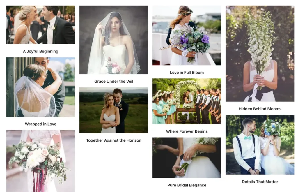
The Elementor Masonry Gallery widget lets you create beautiful image galleries with flexible layouts and lightbox support. You can control image resolution, columns, spacing, overlays, titles, captions, borders, shadows, and lightbox styling for a fully customized gallery experience.
Content settings
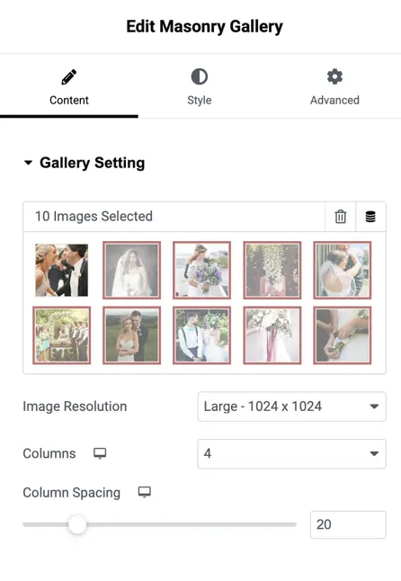
Images
Select one or multiple images from the Media Library to include in your gallery.
Image resolution
Choose the resolution/size for gallery images to ensure they display crisply on all devices.
Columns
Select the number of columns for the gallery layout supports up to 10 columns for flexible grid designs.
Columns spacing
Set the spacing (in px) between columns to increase or decrease visual gap between images.
Elements
Title toggle
Enable to show or hide the title for each gallery image.
Show Title In
Control where the title appears:
Gallery
Lightbox
Both
Caption toggle
Enable to show or hide the caption for each image.
Show Caption In
Choose where caption text appears:
Gallery
Lightbox
Both
Overlay on hover
Toggle to enable overlay effects when the user hovers over an image.
Overlay icon
Choose an icon to show as the overlay indicator during hover.
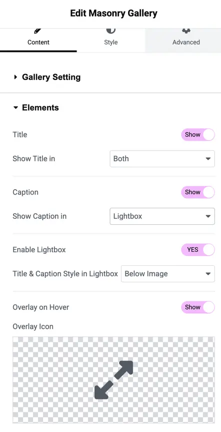
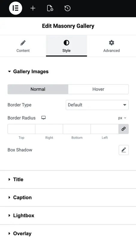
Image styling
Border type
Choose a border style for gallery images:
- None
- Solid
- Dashed
- Dotted
- Double
- Groove
- Etc.
Border radius
Adjust how rounded the image corners appear.
Box shadow
Add shadow below images to create depth and visual separation.
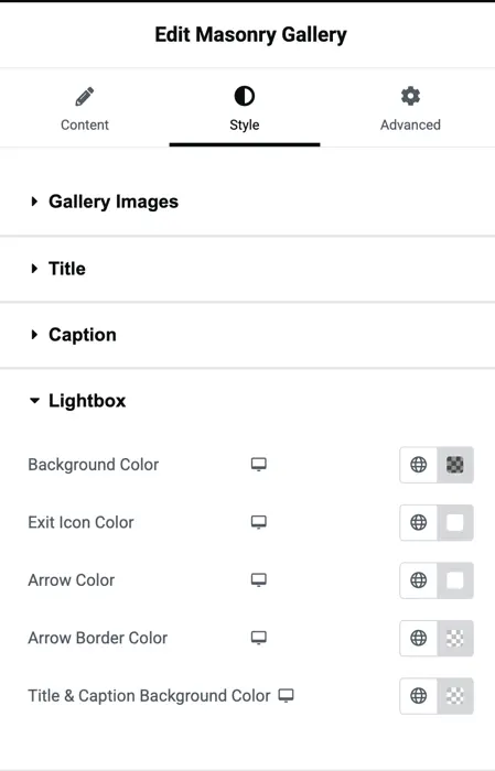
Lightbox settings
Once an image is clicked, the Lightbox opens and it’s fully customizable:
Background color
Set the lightbox overlay background color.
Exit icon color
Customize the color of the close (X) icon.
Arrow color
Choose the color of the navigation arrows inside the lightbox.
Arrow border color
Set a border color for lightbox arrows if needed.
Title and Caption background color
Define a background color behind titles and captions when viewing images in the lightbox.