Search for answers or browse our knowledge base.
Scroll Progress
The free Scroll Progress widget included in WPMozo Addons Lite lets you add a clean, customizable scroll indicator to your Elementor pages. With layout options such as Bar, Circle, and Half Circle, plus detailed controls for colors, size, and percentage text, this widget enhances user experience and helps visitors track their reading progress with ease.
How to add widget on page
Once the WPMozo Addons plugin is activated, it adds several widgets to the Elementor builder. To insert the Before After Slider widget, follow these steps.
- Create/edit a page/post that uses Elementor builder.
- Create/edit container.
- Search widget Scroll Progress under WPMozo.
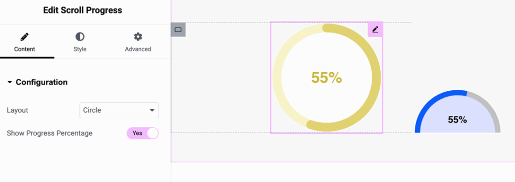
Configuration
Choose the type of scroll progress indicator to display.
- Bar – Shows a horizontal or vertical progress bar.
- Circle – Displays progress in a circular shape.
- Half Circle – Shows progress in a semi-circular form.
Show progress percentage
Toggle to display or hide the percentage value indicating how much of the page has been scrolled.
- Yes/No
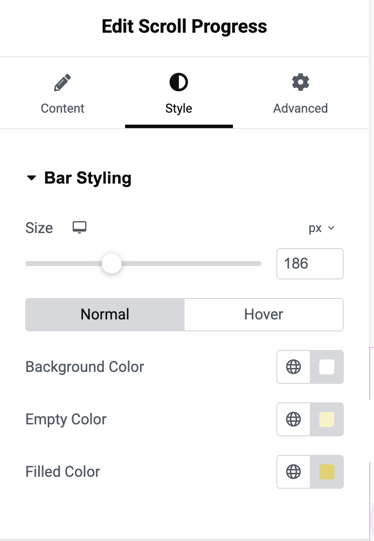
Bar styling
Styling controls for the progress bar or circular indicators.
Size
Specifies the thickness or diameter of the progress indicator.
- Unit: pixels
- Example: 186px
Background color
Sets the background color of the entire progress indicator in its Normal and Hover states.
Empty color
Defines the color of the unfilled portion of the progress bar or circle.
Filled color
Defines the color of the filled (completed) portion of the progress bar or circle.
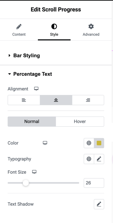
Percentage text
Controls the appearance of the percentage text shown inside or near the indicator.
Alignment
Adjusts the alignment of the percentage text based on the selected layout.
Color
Choose different text colors for Normal and Hover states.
Typography
Controls the font family, weight, style, and text transform for the percentage text.
Font size
Sets the size of the percentage text.
- Example: 26px
Text shadow
Adds shadow effects to the percentage text for enhanced readability or style.