Scroll Stack Cards
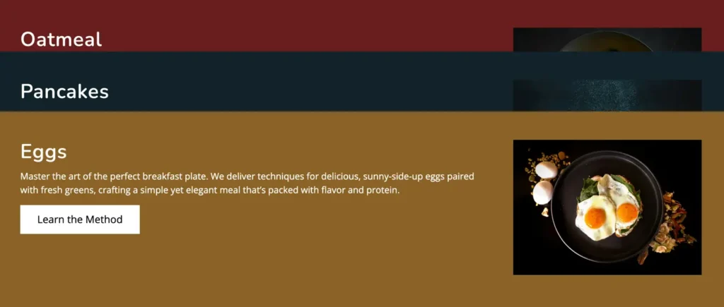
The Scroll Stack Cards Block is a free Gutenberg block that helps you display content in stacked, scroll-based cards. With global display and animation controls, you can manage layout orientation and animation timing easily. This block is ideal for creating interactive sections.
Adding the block
To add the block:
- Click the “+” button to add a new block.
- Search for “Scroll Stack Cards” and select it.
General
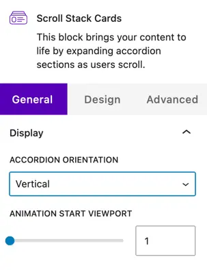
Display
Choose how the accordion items are displayed:
Accordion orientation
- Vertical – Items are stacked one below another, which is ideal for long content and standard page layouts.
- Horizontal – Items are aligned side by side, creating a more interactive and modern layout.
Animation
Animation start viewport
This setting controls when the animation starts as the user scrolls the page.
- The default value is 1.
- A lower value starts the animation earlier.
- A higher value delays the animation until the element is more visible in the viewport.
General settings
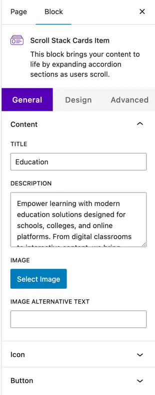
Content
Title
Enter the main heading for the card. This is usually used to highlight the feature, step, or section name.
Description
Add a short description or supporting text below the title. This helps explain the content of the card in more detail.
Image
- Select Image – Upload a new image or choose one from the media library to display on the card.
- Image Alt Text – Add alternative text for accessibility and SEO purposes.
Icon
- Show Icon – Enable this toggle to display an icon on the card.
- Icon Selector – Choose an icon that represents the card content visually.
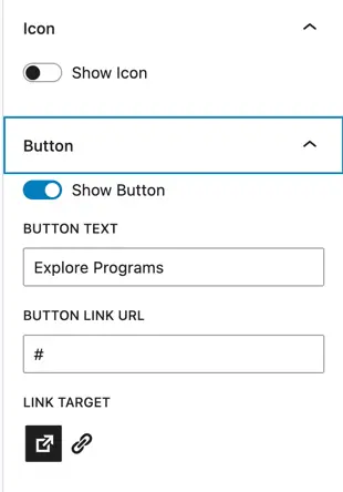
Button
- Show Button – Enable this option to display a button on the card.
- Button Text – Enter the label text for the button (e.g., Learn More).
- Button Link URL – Add the URL the button should link to.
- Link Target – Choose whether the link opens in the same tab or a new tab.
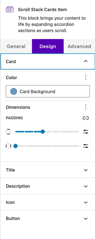
Design settings
Card styling
- Color – Set the background color of the card.
- Dimensions – Control the spacing and layout of the card.
- Padding – Adjust the inner spacing of the card content for better readability.
Title Design
Customize the appearance of the card title:
- Text Color
- Typography (font size, weight, letter spacing, etc.)
Description design
Style the description text to match your site design:
- Text Color
- Typography options for improved readability
Icon design
Control how the icon appears on the card:
- Icon Color
- Icon Size