Dropdown Button
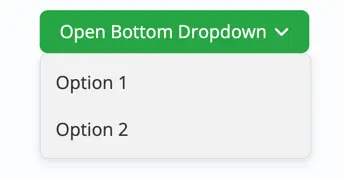
The Dropdown Block (Free) lets you create clickable or hover-activated dropdown menus. It’s useful for displaying extra links, call-to-actions, or information in a neat, expandable format. With flexible alignment, background styling, and typography options, you can design dropdowns that blend seamlessly with your website.
Adding the block
To add the block:
- Click the “+” button to add a new block.
- Search for “Dropdown Button” and select it.
- For detailed instructions on how to add blocks in Gutenberg, please refer to the official WordPress Block Editor documentation.
Block settings
General settings
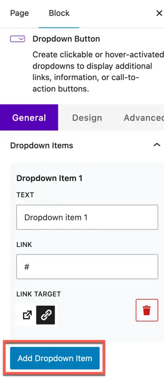
Dropdown items
- Dropdown Item (Text) – Add the text you want to display inside the dropdown.
- Link – Insert a URL for the dropdown item.
- Link Target – Choose whether the link opens in the same tab or a new tab.
- Add Dropdown Item – Use this button to add multiple items to your dropdown list.
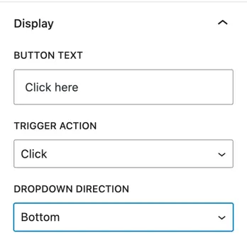
Display
- Button Text – Set the text for the dropdown trigger button (e.g., Click Here or More Info).
- Trigger Action – Select how the dropdown opens:
- Click – Dropdown opens when the button is clicked.
- Hover – Dropdown opens when the user hovers over the button.
- Dropdown Direction – Choose where the dropdown menu will appear:
- Bottom, Top, Left, Right
Design settings
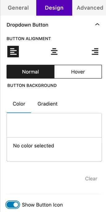
Dropdown button
- Button Alignment – Align the button (left, center, right).
- Normal / Hover – Style the button separately for default and hover states.
- Button Background – Choose a Color or Gradient for the button background.
- Show Button Icon – Enable an icon next to the button text for added visual clarity.
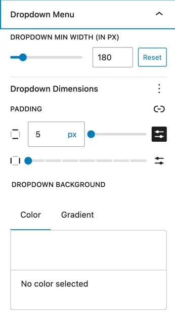
Dropdown menu
- Dropdown Min Width – Set the minimum width of the dropdown menu (in px).
- Dropdown Dimensions – Adjust padding (inside spacing) for the dropdown items.
- Dropdown Background – Pick a Color or Gradient background for the dropdown menu.
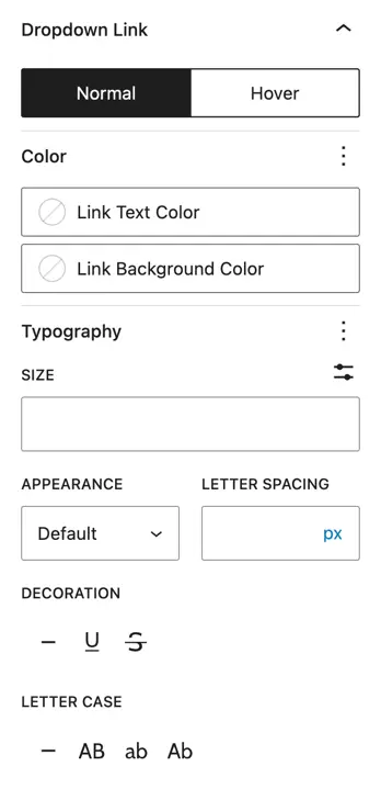
Dropdown link
- Normal / Hover – Define text and background colors for dropdown links in default and hover states.
- Link Text Color – Set the color of the link text.
- Link Background Color – Choose a background color for each link item.
- Typography – Customize:
- Font Size
- Letter Spacing
- Font Appearance (weight/style)
- Text Decoration (underline, strike, etc.)
- Letter Case (uppercase, lowercase, capitalize)