Image Card
The Image Card Block is a free and versatile block that lets you display images or icons with titles, descriptions, and buttons in a stylish card layout.
It helps highlight key content or features in an attractive and organized way.
Adding the block
To add the block:
- Click the “+” button to add a new block.
- Search for “Image Card” and select it.
- For detailed instructions on how to add blocks in Gutenberg, refer to the official WordPress Block Editor documentation.
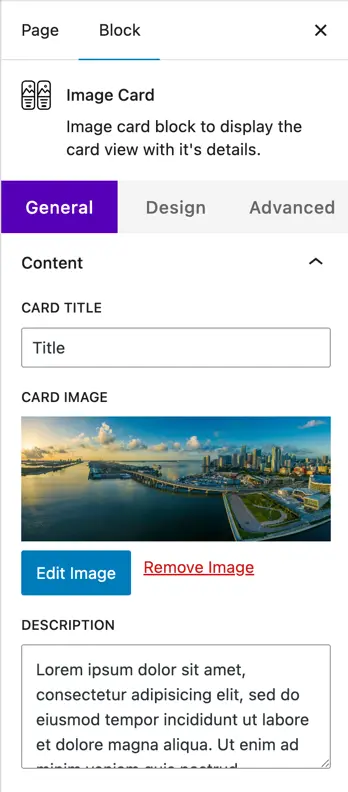
Content configuration
- Card Title
Add a title for your card. This will appear at the top of the image card. - Card Image
Upload or select an image from the media library to display on the card. - Description
Enter the text content you want to show on the card under the title.
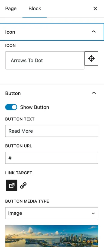
- Icon
Choose an icon to display on the card. - Button
- Show Button: Enable this toggle to display a button on the card.
- Button Text: Set the text that will appear on the button.
- Button URL: Enter the link where the button should redirect.
- Link Target: Choose whether the link opens in the same tab or a new tab.
- Button Media Type
Choose how you want to display media on the button. Available options are:- None – No media will appear.
- Icon – Lets you choose an icon to show on the button.
- Image – Lets you upload an image to show on the button.
- Position of Media Type
Set the position of the chosen media (icon or image) on the button. - Show Media on Hover
Enable this toggle if you want the selected icon or image to appear only when the user hovers over the button.
Design customization
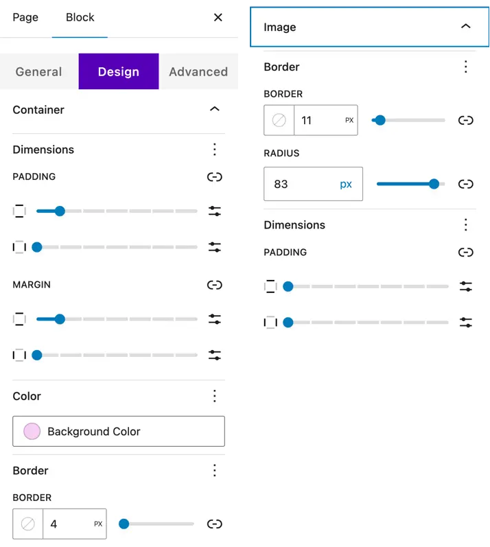
Container
Customize the overall card container with:
- Dimensions – Adjust width and height.
- Padding & Margin – Add inner and outer spacing around the card.
- Color – Set the background color of the container.
- Border – Customize border style, width, color, and border radius.
Image
Style the image used in the card (if added).
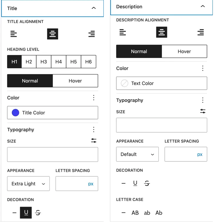
Title
- Title Alignment – Set the alignment (left, center, right).
- Heading Level – Choose the heading tag (H1–H6).
- Color – Set the title text color.
- Typography – Customize font family, size, weight, and spacing.
Description
- Alignment – Set text alignment.
- Color – Choose description text color.
- Typography – Control font family, size, weight, and spacing.
Content (Icon and Button Styling)
- Content – Customize color, dimensions, and padding.
- Icon
- Color – Set icon color.
- Font Size – Adjust icon size.
- Alignment – Set icon alignment.
- Icon Shape – Choose from circle, square, or hexagon.
- Button
- Color – Set text and background colors.
- Alignment – Position the button.
- Typography – Adjust font settings.
- Border & Border Radius – Customize the border style and rounded corners.
- Hover Options – Set hover colors, borders, and border radius.